Contents
Spike detection and sorting
Detection
Template recognition
Spike sorting
by Feature
Manual clustering
Undo clustering
Automatic clustering
Partition by colour
by Value-at-time
by Principal component
by Wavelet coefficient
Manual coefficient selection
Spike detection and sorting
The first task in most analyses involving extracellular spikes is simply to detect the spikes, and distinguish them from noise. However, extracellular recordings commonly include spikes arising from activity in several different axons, and it is often desirable to distinguish those caused by activity in one axon from those caused by activity in other axons. Spike sorting is the process of trying to allocate particular spikes to particular axons.
The waveform of the extracellular spike produced by a given axon firing in isolation depends on several factors, including the configuration of the extracellular recording electrodes (monopolar or bipolar, suction etc.), the direction of spike propagation, the distance of the axon from the electrodes, and the diameter of the axon. However, the amplitude of the extracellular spike depends primarily on the diameter of the axon, since fat axons produce greater transmembrane currents, and hence larger extracellular field potentials (spikes).
Under ideal conditions each axon contributes a spike which is constant in shape and different from the shapes produced by other axons. This means that by clustering potentials into categories in terms of their shapes, it should be possible to sort out which potentials come from which axons. However, a confounding problem is that when different axons are active in synchrony or near synchrony, their extracellular currents summate approximately additively, producing new compound spike profiles. Another problem, of course, is that axons which have similar diameters and are conducting in the same direction will tend to produce similar-sized and shaped spikes, and these may be not be distinguishable. This problem is exacerbated if the signal-to-noise ratio is low (in fact, if it is very low, it is difficult to detect spikes at all, let alone sort them into categories). Finally, extracellular spike waveforms may not be actually constant in time, even when they derive from the same axon.
Spike detection
DataView takes two approaches to spike detection. The first uses a template-matching algorithm with a liberal error criterion. This detects a range of waveforms which are basically spike-shaped. These are then separated into clusters using one of several options, including principal component analysis, wavelet analysis, or simple features such as peak-to-peak amplitude. The advantage of this approach is that it is quick and quite simple, and it allows focused attention to be paid to a subset of interesting potentials. The disadvantage is that it is not possible to resolve compound spikes into their underlying constituents. This approach is not wizard-based; the user performs each stage independently.
[Note: A full description of using template matching to detect a single spike type is given here. In the current tutorial we will use template matching to detect multiple spike types.]
The second approach uses a threshold-crossing algorithm to try to detect all spikes in a trace, and then clusters them using principal component analysis. The advantage of this approach is that because a library of all detectable fundamental spike profiles becomes available, this can be used to decompose compound spikes resulting from the synchronous or near-synchronous activity of individual axons. A Spike Sorting Wizard guides the user through the stages of this analysis. NOTE: this wizard is still under development.
Template spike recognition
If the user is only interested in a subset of spike types, and does not need to decompose compound spikes, then spikes can be sorted using template recognition and a variety of clustering methods.
- Load the file r3s.
This shows a recording from the superficial branch of the 3rd nerve root of a crayfish abdominal ganglion (hence the name). You can see a variety of spike sizes and shapes in the main view but in fact this nerve only contains 6 axons, and only 4 of these are usually spontaneously active (Evoy et al., 1967). It therefore makes it a good testbed for the clustering methods available in DataView.
- Set the timebase (the scale in the middle of the X axis) to 4 ms/div, to zoom in on the early part of the recording.
The left-most spike will form the template, since it is has a fairly typical shape and size for spikes in this recording. - Use the Cursors: Place at time menu command to place two vertical cursors, one at 10 ms, the other at 12.1 ms.
(Note: the displayed cursor times will probably not match these values exactly because they report time based on the screen pixel of their location.) - Select the Event edit: Template recognition menu command to open the Template recognition dialog.
Note that the default Allowed error is set to 25, which is a good general starting value. - Click Capture to make the data between the cursors the search template for matching spikes.
- Use the Cursors: Del all vert command to get rid of the cursors, which are no longer needed.
We can monitor spike recognition by simultaneously viewing the 2D Scatter graph and the Scope view.
- Select the Event analyse: 2D scatter graph menu command to open the graph dialog.
- In the Graph dialog, select P2P amp as the parameter for the Y axis.
- Select the Event analyse: Event-triggered scope view command to open the Scope view.
- Set the count to -1 so that the view will show all detected waveforms (although there aren't any at the moment).
- Try to position the two dialogs so that you can see them and the Template dialog (and some of the main view) at the same time. That may not be possible unless you have a dual monitor setup or a very large screen, but don't worry, you can always just select a dialog to bring it to the top of the stack and uncover it.
At the moment neither graph shows anything because there are no events (we have not yet recognized any spikes), but that will soon change.
- In the Template dialog, click Analyse.
The Template count value should show that 326 waveforms have been found that match the template with the specified error. Each of these is marked by an event in channel a (the default selection).
The Scatter graph updates as events change and it now shows two distinct amplitude bands. The Scope view also updates, and shows the two distinct spike shapes.
- Click anywhere in the upper band in the Scatter graph to centre the event in the main view.
Note that the spike is similar in amplitude to the template spike. You could check the template spike by clicking the Go to start button ( ) in the main toolbar. Note that the event marking the template spike is tagged, and is drawn with a thicker line.
 - Now click in the lower band.
The centred spike is smaller than that of the template. - You can also click on a spike waveform in the Scope view to centre that spike in the main view.
If we wanted to only select spikes that actually match the template, we would need to reduce the Allowed error.
- In the Template dialog set the Allowed error to 12.
- Click Analyse.
The Scatter graph now shows a single band of amplitude, indicating that all the recognized spikes have a similar amplitude to the template spike. (Of course, spike height is just one measure of similarity to the template, we will use more sophisticated measures later.) The Scope view also just shows one spike type.
However, our aim at the moment is to recognize as many different spike types as possible, so we need to increase, not reduce, the Allowed error.
- Set the Allowed error to 45 and click Analyse.
There are now 3 bands of amplitude visible in the Graph dialog. - Set the Allowed error to 80 and click Analyse.
There are now 5 bands in the graph. - Click a few times in the very lowest band, and note that the centred events are essentially membrane noise. So this error allowance is too big.
- In the Scatter graph, change the parameter for the X axis to Template error.
The Scatter graph now shows a plot of template error vs peak-to-peak amplitude for each detected match to the template (with a very large allowed error). There are 5 distinct clusters in the graph, the right-most of which corresponds to the largest template error (greatest X axis value). It is also the cluster with the lowest amplitude (smallest Y axis value).
- Click within the bottom-right cluster in the Scatter graph a few times, to confirm that the waveform centred in the main view is indeed mainly noise.
- Click within the right-most cluster to confirm that the waveform centred in the main view is a spike that resembles the one chosen as a template.
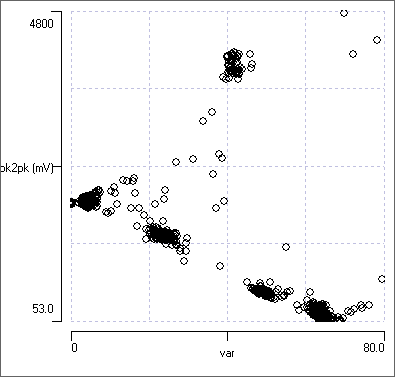
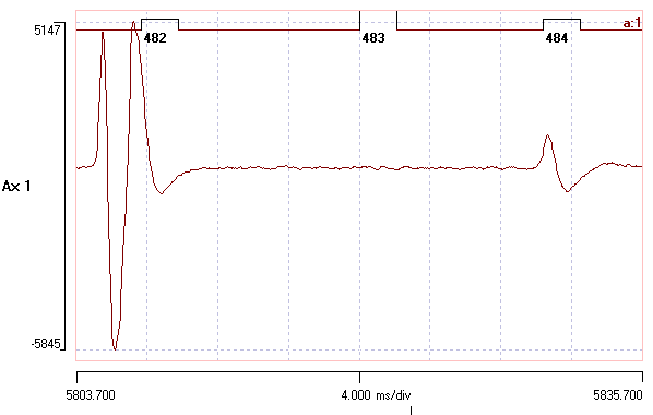
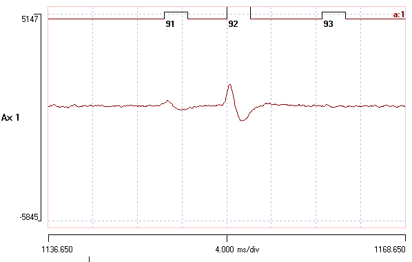
- Hover the mouse just to the left of the noise cluster in the Scatter graph, and note the X value at this region of the graph (visible near the top-right of the dialog). You should that it is about 58.
- Set the Allowed error in the Template recognition dialog to 58.
- Click Analyse.
There are now a total of 542 waveforms recognized as a match to the template within the allowed error, and these fall into 4 distinct spike shapes which are visible in the Scope view, and 4 clusters visible in the Scatter graph. The noise cluster has disappeared.
For your convenience, the analysis so far is available as the file r3s 58.
Spike Sorting
The next job is to partition the events within channel a so that we can distinguish between the 4 spike shapes that its events mark. This is called spike sorting.
The basic strategy for spike sorting in DataView is to assign each event in a channel to a particular group by giving it a specific colour that identifies that group. Thus at the end of the sorting process all spikes arising from a particular axon will have events of a particular colour, while spikes arising from a different particular axon will have events with a different particular colour. When all events have been satisfactorily assigned to the appropriate colour then events in each colour group can be copied into a separate empty event channel.
This raises the obvious question of how to assign each event to the appropriate colour group: we need a way of grouping events based on similarities in the waveforms of the underlying data. The problem then comes down to how to recognise similarity in shape.
DataView implements 4 techniques for clustering event waveforms based on shape.
- Feature extraction.
- Value-at-time comparison
- Principal component analysis.
- Discrete wavelet transformation.
In my experience the most useful general method is that using Principal component analysis, and this would normally be my first choice. However, for tutorial purposes it is easier to describe the methods in the order given above.
Sort by Feature
The simplest features defining waveform shapes are parameters such as the peak-to-peak amplitude within the waveform, or the time interval between the positive and negative peaks in the waveform.
- If the Scatter graph is not showing already, activate it using the Event analyse: 2D Scatter graph menu command and select P2P amp for the X axis data type, and P2P Dur for the Y axis data type.
- If the Scope view is not already showing, activate it using the Event analyse: Event-triggered scope view menu command and set the count to -1 to show the waveform of all the events.
- In the Scope view, select the from Events option in the Sweep colours frame.
All the sweeps should show in black, because at the moment all the events are black.
There are 4 reasonably distinct clusters visible in the Scatter graph, plus a collection of outlier points that don’t fit well into any cluster. If you click on a point within a cluster, you should see a representative spike centred in the main display (with its event drawn slightly taller than normal, to indicate that it is the one that you clicked on). If you click on an outlier point to centre its waveform, you will see that most outliers are caused by spike summationOf course, the spikes themselves do not summate, it is just the extracellular field potentials that summate when spikes in separate axons overlap in time. distorting the waveforms.
[Note: we could have used the clusters visible in the error vs amplitude graph seen earlier, but the error criterion is only available if spikes have been detected using the template method. The amplitude and duration parameters are available even if spikes have been detected by threshold-crossing.]
Manually Clustering (not recommended!)
- In the Scatter graph, click the Sel button within the Selection group and drag the mouse in a circle around the right-most cluster (the events whose waveforms have the largest peak-to-peak amplitude) in order to select them.
- Click the Colour button, and note that the entire cluster turn red.
Also note that the largest spikes in the Scope view are now drawn in red. - Click on a point within the red cluster, and note that the event in the main display is also now drawn in red.
- Click Cancel within the selection group to get rid of the selection box around the red cluster. (This does not undo the colour assignment.)
- Next click the red-coloured button beside the text Target col, and click the blue button in the Choose colour dialog.
Note that the Target col button is now blue. - Click the Sel button again and draw around the cluster with the next largest peak-to-peak amplitude.
- Click the Colour button to turn it blue.
You could continue to colour the two remaining clusters and then go on to partition the events based on their colours, but it is easier, and more objective, to use the automatic clustering facility described later.
- Undo the cluster colours you have assigned, as described in the next section.
Undo Clustering
If you have assigned events to different colours as part of a clustering process (either manually or by automatic clustering) and decide that you do not like the assignments, you can undo them.
- Select the Event edit: Event channel properties menu command to open the Event channel properties dialog.
- Click the Reset button beside the Colour count box.
All events in the selected channel will be set to the default colour, which is black.
Automatic Clustering
DataView has an automatic clustering facility based on the algorithmFrom Bouman's web page: "The ... program applies the expectation-maximization (EM) algorithm together with an agglomerative clustering strategy to estimate the number of clusters which best fit the data. The estimation is based on the Rissenen order identification criteria known as minimum discription length (MDL). This is equivalent to maximum-likelihood (ML) estimation when the number of clusters is fixed, but in addition it allows the number of clusters to be accurately estimated." developed by Charles A Bouman (Copyright © 1995 The Board of Trustees of Purdue University"In no event shall Purdue University be liable to any party for direct, indirect, special, incidental, or consequential damages arising out of the use of this software and its documentation, even if Purdue University has been advised of the possibility of such damage. Purdue University specifically disclaims any warranties, including, but not limited to, the implied warranties of merchantability and fitness for a particular purpose. The software provided hereunder is on an "as is" basis, and Purdue Univeristy has no obligation to provide maintenance, support, updates, enhancements, or modifications." And the same goes for DataView! ).
- Click the Cluster button near the top-right of the Scatter graph dialog to display the Cluster dialog.
[Automatic clustering is also available from a number of other DataView facilities, but this is how we will access it for this section of the tutorial.]
The dialog shows that there are 542 events, and just 2 dimensions (the amplitude and duration values of each point). You could set the Target cluster count to specify the number of clusters you want to partition the data into, in which case the programme makes the best assignment it can to that number of clusters, or you can leave its value at 0, in which case the programme itself attempts to determine the number of clusters present in the data. We are pretty sure there are 4 different spikes, plus some random shapes due to collisions, so we could set the Target cluster count to 5. However, leave it at 0 to see how the automatic assignment performs.
- Click the Cluster button to initiate clustering. After a brief period, you should see the following:
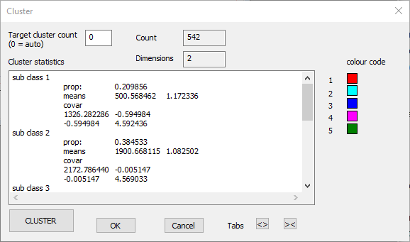
Note that the events visible in the main view now each have colours representing the group to which they belong. The Scatter graph and the Scope view should look like this:

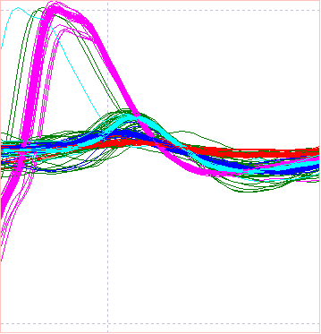
We can see that the 4 spike types are clearly distinguished, plus the mixed assortment of spikes in dark green. The latter are generated by waveforms that result from spike overlap, and thus will be amongst the worst matches to the template.
At the moment the colour assignments are not "locked in". If you click Cancel in the Cluster dialog all the events revert to their previous colour (black). However, the cluster assignments look reasonable, so click OK to accept them and dismiss the Cluster dialog.
Partition Events into Separate Channels using Colours
When you have coloured the events as described above:
- Click the Partition button at the top-right of the Scatter graph dialog (also available through the Event edit: Partition/edit using colours menu command).
There are 5 colours in event channel a (the 4 clusters, plus the outliers in the original black colour), and by default the Partition dialog box will copy each colour into a different event channel, choosing the next empty channels (b to f).
- Click OK in the Partition dialog.
- In the Scope view, scroll through event channels b to f.
Note that 4 of these new channels contain a reasonably uniform collection of waveforms, probably originating from a single spike, while 1 event channel contains a wide variety of waveforms; the outliers.
The four channels containing uniform waveforms could be used to derive new templates (using the Replc w avg button in the Template recognition dialog) for much more specific recognition of these 4 waveforms. Note that we could have done the event clustering using only a portion of the total record, and then used the derived specific templates to analyse the complete record. This would be a sensible strategy for dealing with a very large data file, or several files containing data recorded under identical conditions.
Sort by Value-at-Time
The peak-to-peak parameters may not always be the best for distinguishing between waveform shapes. Another option is to use the actual data values of the waveform at specific times relative to the event.
- Close and re-load the file r3s 58 to get back to the starting state.
- Select the Event analyse: Shape classification/clustering: Value at Time command to activate the Value-at-Time Classification dialog box.
You can enlarge the dialog itself by dragging one of its corners. - Set the Count to 100 so that you see a reasonable selection of spikes, but not so many as to overwhelm the display.
[You could temporarily set the Count to -1 to see all of the spikes, but the "noise" spikes tend to fill in the gaps between the "pure" spikes, making the shapes less easy to distinguish.]
The main part of the dialog shows a trace display very similar to the Scope view, and several of the dialog controls have similar functions to that view. However, note that there are 3 coloured lines drawn vertically across the traces. These are cursors, and they can be positioned by dragging them with the mouse. On the left of the dialog in the Cluster group is a list box with coloured labels A, B and C beside it. The values in the box show the sample bin at which the cursor of that colour is positioned in the display. So the red cursor A is at bin 16 (counting from the left of the display). The initial values are arbitrary - just evenly spaced across the display.
The histogram on the right in the dialog shows the distribution of values at the location of the Track cursor, which by default is cursor A. The cursor position itself is shown in the Sample edit box, which shows 16 (like the list on the left).
Note that the red cursor A crosses traces near the peak of the very large spike, and fairly near the baseline of the other spikes. This is reflected in the histogram, which shows a highly bimodal distribution, with a smallish peak on the right, reflecting the very large spikes, and a larger, more spread-out peak on the left, reflecting the baseline values of the other spikes.
The AIM is to position the 3 cursors at locations in which there is the maximum separation of trace values between the different spike types. The histogram is meant to help in making the decision for the best locations. [If desired you could add extra cursors with the Add x cur button, but for these data 3 cursors are entirely sufficient.] However, there is strong serial correlation between data values in adjacent bins, so you also want to place the cursors as far apart from each other as possible, to avoid attempting to cluster using redundant information.
- Select the Event analyse: 3D scatter graph command and try to position it so that you can see both it and the Value-at-Time dialog.
- In the scatter graph set the X, Y and Z axes to Val at Time A-C. The points on the scatter graph reflect the data values at the times of the cursors in the Value at Time dialog.
- You can rotate the 3D graph by dragging it with the mouse.
With the initial settings you can see 3 clear clusters in the 3D graph, even though there are 4 spike shapes visible in the Value-at-Time dialog. This is because the cursors are not positioned optimally.
- Repeatedly click the up spin control of the Sample edit box in the Value-at-Time dialog, until it reaches a value of 24.
As the red cursor moves to the right across the display, it enters a region where the traces of the 4 spike shapes are clearly separate from each other. Simultaneously, the histogram displays 4 peaks, and the 3D graph displays 4 clusters. The red cursor is now well-positioned. [You could also have dragged it with the mouse to this location, but using the spin control shows how the graph makes the transition from 3 clusters to 4.]
- Select B as the Track cursor, and note how the Sample value changes to 31 (the location of the green cursor B) and the histogram changes to show 2 quite broad peaks.
- Set the Sample to 12.
This shifts cursor B to a region where there are just 2 trace overlays, but they are very widely spaced. The 3D graph now shows greater separation betwen the 4 clusters.
- Finally, select C as the Track cursor and set the Sample to 43.
The cluster separation is now very clear in the 3D graph, so you are ready to go.
- Click the Cluster button in the Value-at-time dialog to open the Cluster dialog.
- Position the Cluster dialog so that you can see the other two open dialogs, and click the Cluster button.
After a brief pause, the traces in the Value-at-Time dialog should be coloured to reflect the different spike shapes, and the clusters in the 3D graph should also be coloured.
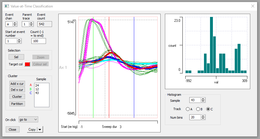
- You could now "lock in" the clusters and partition the events as before, but that would just cause more work to undo, so click Cancel in the Cluster dialog to return to the un-coloured events.
- Close the Value-at-Time dialog.
Sort by Principal Component Analysis
Sorting by features works well if the waveforms can be distinguished from each other using the analysis features that are pre-built into DataView, but these are necessarily limited in number and may not be enough to distinguish between complexIt is obviously possible to have two waveforms with identical peak-to-peak amplitudes and durations, but with highly significant differences in the data values between these defining features. waveforms. Sorting by value-at-time is essentially heuristic, and requires the user to make subjective decisions about the best times at which to measure the values.
It would be nice if there were some parameter set that encapsulated aspects of the whole shape of the waveforms, and if these could be chosen automatically so as to maximise their efficiency. Principal component analysis (PCA) provides just such a set of parameters.
Principal components are explored in more detail elsewhere, so this section just describes how PCA is used in DataView for spike sorting.
- If it is not already active, load the file r3s 58.
- If you have already performed clustering on this file, delete all event channels except channel a, and Reset the colours in channel a to black.
- If necessary, open the Scope view and set the count to -1 and the Sweep colours to from Events, and open the 2D Scatter graph and set it to display P2P amp vs P2P dur as before.
It is a useful fact that although there are actually the same number of principal components as there are spike waveforms (in this case 542), often the first 3 principal components of spike waveforms provide enough information for spike sorting, so DataView provides rapid access to these.
- Select the Event analyse: 3-D scatter graph menu command to open the 3D Scatter Graph dialog.
- From the Axes drop down lists on the mid- left of the dialog, select PC1 wt for the X axis.
The Principal component analysis (NIPALS) dialog displays. This implements a rapid algorithm (non-linear iterative partial least squares - hence the acronym) that calculates the first 3 principal components.
- The default settings are suitable, so click OK to activate the calculation and dismiss the dialog.
- In the 3-D scatter graph select PC2 wt and PC3 wt for the Y and Z axes respectively.
The 3 D graph now shows the first 3 principal components, and 4 clusters are clearly visible, indicating that the first 3 PCs do indeed provide enough information for sorting.
If you wish to explore the data, you can re-orient the graph by dragging it with the mouse, or set it to auto-rotate about an axis, by selecting the appropriate choice from the Rotation group.
When you have finished exploring, select the Mouse (or None) option, and click Default to return the graph to a known orientation.
- Click the Cluster button near the bottom-left of the dialog.
- Follow the same procedure as previously described in the Automatic clustering section of the tutorial.
More details
If you suspect that there might be useful information in more than the first 3 principal components, or if you want more information about the components themselves:
- If you have already performed clustering on this file, delete all event channels except channel a, and Reset the colours in channel a to black.
- Optionally, Close the Scope view.
- Select the Event: Analyse: Shape classification/clustering: Principal component analyis: Calculate menu command to open the Principal component analysis (covariance) dialog.
- Position this dialog so that you can see it and the 2D Scatter graph.
- Note that the Number PCs (at the top-right of the dialog) is set to 3. We will change this later.
- Click Calculate.
The calculation algorithm is slower than the NIPALs algorithm, but gives more details.
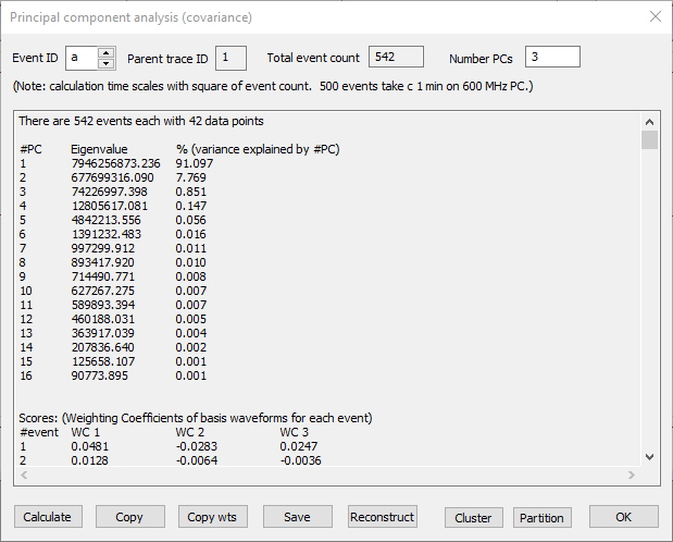
First, note the lower block of data in the output, labelled Scores. There are 542 rows in this block, one for each event. There are 4 columns. The first just shows the event ID, the remaining 3 show the weighting coefficients of the first 3 principal components (it is 3 because that is the Number PCs selected). These numbers give the X, Y, Z coordinates for each point in the 3-D scatter graph that you saw earlier, and it is these numbers that were used in clustering.
Now look at the upper block of data, and note the column % (variance explained by #PC). This basically tells us how much of the difference between spike shapes is accounted for by that principal component. As can be seen, the first 3 components account for more than 99% of the difference, which is why good clustering can be achieved from just these components.
- Click the Cluster button to call up the Cluster dialog.
- Click the Cluster button in the Cluster dialog.
Look at the 2-D scatter graph, which should now show coloured clusters very similar to those seen previously.
- Click Cancel in the Cluster dialog so that you do not lock in this particular cluster assignment.
What happens if we use more than 3 principal components for clustering?
- Set the Number PCs to 8.
This takes us down to a component that only accounts for 0.01% of the variability - i.e. the higher components account for 99.99%. - Click Calculate.
Note that the second block of data in the Principal component dialog now has columns for 8 weighting coefficients. - Click Cluster to open the Cluster dialog.
Note that this dialog shows that 8 dimensions will be used in clustering. - Click Cluster.
The 2-D scatter graph shows clustering that is very similar to that achieved with just 3 components.
- Cancel the Cluster dialog.
- Set the Number PCs to 16, and again Calculate and Cluster the data.
The cluster result is now worse than it was using fewer dimensions!
The problem is that the clustering algorithm "can't see the wood for the trees". The lower principal components mainly encode random noise in the signal, and this has no correlation between spikes, even when they belong to the same class. The algorithm treats all the dimensions in the data as being of equal importance, so these noise dimensions tend to cause the algorithm to merge clusters into one mega-cluster reflecting the noise.
The bottom line is that with spike sorting based on clustering principal componnts, using more components is not necessarily better. In fact, with these data, excellent clustering can be achieved with just the first two principal components:
- Set the Number PCs to 2, and again Calculate and Cluster the data.
Note that the 2-D Scatter Graph allows selecting the first two principal components (PC1 wt and PC2 wt) as the X and Y display parameters, and you could cluster on these directly from within the scatter graph.
Sort by Discrete Wavelet Transform Coefficients
An alternative method for cluster analysis uses the discrete wavelet transform (DWT), which, in some circumstances, provides a better basis for spike sorting than PCA (Letelier & Weber, 2000). The meaning of the wavelet transform and the interpretation of its output is quite complicated and is explored elsewhere in this tutorial, but hopefully the following gives enough information to understand its use in clustering.
The DWT takes as input the waveforms underlying each event and yields as output a series of coefficients for each event waveform. There is the same number of coefficients in the output as there is sample bins in the input, but the DWT only works on bin counts that are a power-of-2 in length, so the waveforms input to the DWT may not exactly match the events in duration. The output coefficients are related to the power in the signal that corresponds to a particular frequency and location in the original waveformIn that respect it has functional similarities to the short-term Fourier transform underlying spectrogram analysis. However, it operates on a much shorter timescale, and has a very different mathematical basis.. Input waveforms with similar shapes will have similar coefficients at particular frequency/location bins within the output, and thus clustering of coefficients between events at particular bins gives a method for clustering the waveforms themselves.
- If it is not already active, load the file r3s 58.
- If you have already performed clustering on this file, delete all event channels except channel a, and Reset the colours in channel a to black.
- Select the Event analysis: Shape classification/clustering: Wavelet command to display the Wavelet Classification dialog box.
- Set the Count parameter to 200, to see a good selection of events, but not so many as to crowd the display.
The dialog looks quite complicated, but many of the features are similar to ones we have already seen in other dialogs. The dialog can be resized by dragging on a corner.
There are three main graphical displays in the dialog: the raw waveform, the DWT coefficients, and a histogram of coefficients at a specified location/frequency.
Waveform: The lower left display simply shows the raw data waveforms, so that you can see what you are dealing with. It is similar to the familiar Scope view display, and has many of the same controls. One significant difference is that because the transform only works on powers-of-2 data counts, the duration of the display is set by using a spin button to adjust the Bin count. The default value of 64 is appropriate for these data, so leave it at that.
DWT: The larger upper display shows the coefficients output from the wavelet transform. The transform can be performed using one of the range of mother wavelets which can be selected from the drop-down list, but the default selection of Daubechies-8 is suitable for most spike types, so leave this alone. The gain and position of the coefficient display is adjusted using the local buttons above the display.
The coefficients calculated by DWT are not ordered in the sense that those of PCA are: we have no a priori knowledge of which are the most significant coefficients or which are the best for clustering. The most appropriate coefficients will be those that have a multimodal distribution, where each peak in the distribution is contributed by a different spike type. Coefficients with a unimodal distribution are likely to reflect features common to all the spikes, and so these coefficients are not useful for spike sorting.
NOTE: there is no simple mapping between the coefficents in the DWT display and the raw waveforms. You must not assume that the coefficients at the left of the DWT display correspond to data values early the waveforms
Histogram: To aid in selecting the coefficients for use in clustering, the distribution of values for a selected coefficient is visualized in the histogram display at the lower right.
- Expand the DWT display by setting the right-hand axis scale to 20.
This zooms in to the region where there is most variability in the coefficients.
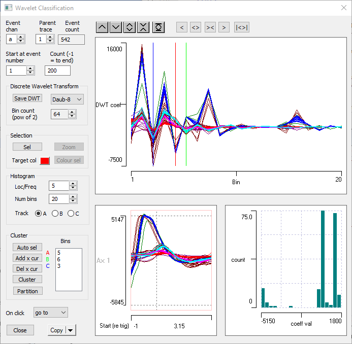
There are 3 coloured lines drawn vertically across the traces. These are cursors, and they can be positioned by dragging them with the mouse. On the left of the dialog in the Cluster group is a list box with coloured labels A, B and C beside it. The values in the box show the coefficient bin at which the cursor of that colour is positioned in the display. So the red cursor A is at bin 5 etc.
It is these 3 coefficient bins that will be used for clustering (although additional cursors can be added to increase the cluster dimensions if require). This is similar to the Value-at-Time clustering method. However, there are two key differences:
- There is no serial correlation between adjacent DWT coefficients, so there is no problem in placing the cursors in adjacent bins. (There definitely is serial correlation in the value-at-time values.)
- By default DataView will automatically select the 3 coefficients whose distribution across events departs most strongly from a normal distribution (after eliminating outliers), since these are likely (although not guaranteed) to have a multimodal distribution. Normality is evaluated using the Kolmogorov-Smirnov test. This follows the suggestion of Quiroga et al. (2004).
In this sample file, this is the coefficients in bins 5, 6 and 3.
- Check the Track A, B and C selections in turn in the Histogram frame to see the coefficient distribution (in the histogram) at the 3 cursor locations.
Return to A after you have viewed the histograms. - Select the Event analyse: 3-D scatter graph main menu option to open the 3D Scatter graph dialog.
This is not essential, but it helps to keep track of what is going on in the tutorial.- Select DWT A, DWT B and DWT C from the drop-down Axes lists in the scatter graph.
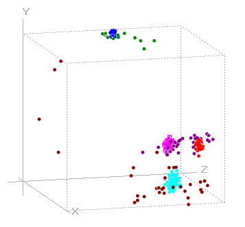
There appear to be just 3 clusters in the graph, which is not promising since we know that there are 4 spike shapes. However, if you drag the graph with the mouse, you will find a 4th cluster "hiding" behind one of the others.
- Click the Cluster button in the Wavelet classification dialog, and carry out clustering as described previously (but do not partition the clusters into different channels).
With the default 3 coefficients, 7 clusters are found. These include 4 clusters reflecting the 4 separate spike shapes, while the remaining 3 are different groupings of the "noise" spikes caused by waveform overlap.
Manual Coefficient Selection
The automatic selection of the least-normally-distributed coefficients is a bit of a blunt instrument for determining the frequency/location bin with the most multi-modal coefficent distribution, but in practice it often works well. However, it can be instructive to look at the distribution in more detail. The histogram display allows this, but it is quite dependent on the number of bins chosen for the histogram. An alternative visualization is to look at a scatter plot of the coefficients in just a single frequency/location bin.
- Select the Event analyse: 2-D Scatter graph from the main menu, to open the 2-D scatter graph dialog.
- From the drop-down axis lists, select ID for the X axis and DWT A for the Y axis.
- In the Wavelet classification dialog, set the Location/frequency bin to 5 (with A as the Track selection).
This is the bin with the least-normal distribution and is the default selection for cursor A.
The 2-D scatter graph shows 3 horizontal bands, indicating that the coefficients at this Location/frequency can only distinguish between 3 of the 4 spikes. The second band from the top has a mixture of 2 dominant colours from the previous clustering, indicating that those two spikes have similar frequency characteristics at the same location.
- Click repeatedly in the second-from-top band in the scatter graph to centre the associated events in the main view. Note that this band is generated by the two smallest spikes.
The two spikes in this band are actually quite different in size and shape, but they apparently have similar power at the freqency and location of that coefficient. (If you want to find out the actual location and frequency you would need to do the full DWT analysis described elsewhere.) - In the Wavelet classification dialog, set the Location/frequency bin to 4.
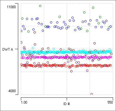
The 2-D scatter graph now shows 4 clear bands, each with its own colour. Clicking within these bands shows that these are indeed the 4 different spike shapes.
figure>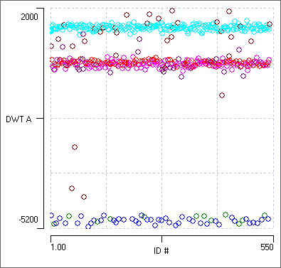
- Click Cluster within the 2-D scatter graph (not within the Wavelet classification dialog).
Clustering now occurs using just 2 dimensions, one of which is simply the consecutive sequence of numbers 1 - 542, which contributes no helpful information. It seems that the DWT coefficients in bin 4 are alone enough to separate out the 4 spikes. It is interesting that this bin is not one of the top 3 least-normal distributions, and so is not included in the the default clustering.
- Click Auto sel in the Cluster frame of the Wavelet Classification dialog to set the cursors at the default 3 least-normal distributions (which should be 5, 6 and 3)
- Set the Location/frequency edit 5, 6 and 3 in turn, and note the coefficient distribution in the 2-D scatter graph (you have already seen the distribution at bin 5).
Each of the default 3 least-normal distributions shows 3 bands. However, the bands are in different combinations in each set, and together they provide the information that allows 4 clusters to be retrieved.
- Finally, set the Location/frequency edit to bin 14.
At this location/frequency the DWT coefficients all fall within a fairly narrow range, and the coefficients contributed by the different spike types (as indicated by event colour) seem to be randomly distributed. It is likely that in this bin the difference between coefficients is entirely due to random noise. This is supported by the bell-shaped distribution seen in the histogram display in the Wavelet Classification dialog.