Contents
Spectral analysis
Background
Fine-tuning
Averaging
Windowing
Overlapping
Sample and Time Bins
Power Spectrum
Power values
Shifting the viewport
Zero-padding data
Log or linear display
Cross-spectrum
Coherence
Importance of averaging
Statistical significance
Importance of noise
Spectrogram
Standard power spectrum
Analyse your own voice
Spectral analysis within events: fly song
Carrier frequency
Spectral analysis
This section starts with some background information on spectral analysis. You can skip this if you want and go straight to the Dataview Power spectrum (including cross-spectrum and coherence) or Spectrogram facilities.
Background
Spectral analysis is a technique which estimates the powerThere is a lot of inconsistency in the literature in how power is expressed in spectral analysis, but in Dataview power is energy per unit time, expressed as the mean square of the signal amplitude. of a signal at different frequencies. The signal is first digitizedAnalog (continuous-time and continuous-amplitude) signals are digitized by passing them through an analog-to-digital converter (ADC). This turns the signal into a series of numbers representing the amplitude of the signal at discrete time intervals set by the sample rate of the ADC. to produce a sequence of sample values and these are then passed through the fast Fourier transform (FFT) algorithm. The algorithm produces a set of equally-spaced frequency bands in a range from 0 (DC) to the Nyquist frequency (half the sampling frequency), and tells us how much power there is within each of these band. The number of frequency bands is determined by the number of samples passed to the FFT routine – there are exactly half-as-many-plus-one bands as there are samples, so the greater the number of samples passed to the algorithm, the higher the frequency resolution. The FFT algorithm only works on data chunks which are a power-of-two samples in length (e.g. 32, 64, 128 etc.). Short signals can be zero-padded to fill them out to the length required for a particular resolution, but this of course reduces the overall power valuesBiologists are often more interested in the relative power of different frequencies, rather than the absolute power values. that the FFT reports.
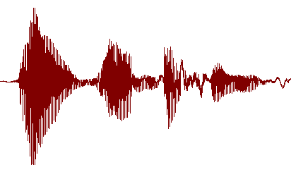
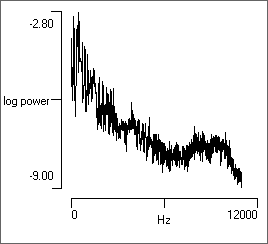
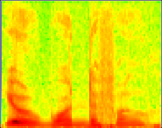
Standard spectral analysis combines all the samples in the signal and produces a single 2D graph showing the average power in each frequency band plottedIt is often more informative to plot the logarithm of the power rather than its linear value, since this makes it easier to detect low (but still significant) power components. However the display can be switched to linear if desired. against the centre value of the frequency band. This tells us nothing about any changes in frequency within the signal, it just gives the overall power/frequency profile of the whole signal. Mathematically, the power spectral density is the Fourier transform of the autocorrelation of a signal, although it is not calculated that way. The power spectrum is available through the Spectrum, Cross-spectrum, Coherence command on the Analysis menu. However, sometimes we are interested in how the frequency changes with time within the signal. In this case the signal is divided into successive chunks which are analysed in series to produce a plot of frequency vs power vs time known as a spectrogramA spectrogram is sometimes called a sonogram – but that term is now mainly used for medical ultrasound images.. These are usually displayed as a 2D graph of frequency vs time, with power (the Z-dimension) being colour-coded. Spectrograms are also available from the Analysis menu in Dataview.
Fine-Tuning the Analysis
There are several parameters that fine-tune the analysis that are common to all spectral analysis facilities in DataView.
Averaging
If the power spectrum is calculated from a single FFT episode, deep math or a book on Fourier analysis tells us that the uncertainty (standard deviation) of the estimate at each frequency is the same as the estimate itself! The uncertainty can be reduced by averaging successive FFT episodes, but of course this increases the amount of data needed for the analysis, and so reduces the time resolution for a given number of samples. It would seem, for instance, that averaging 4 FFT episodes would need 4 times as many samples as just processing one FFT episode. However, Welch's ingenious overlap method (see below) reduces the number of samples needed.
Windowing
In principal, Fourier analysis should be applied to an infinitely long section of periodic data, with the length of the FFT segment an exact integer multiple of the cycle period. In practice, of course, this is never the case. The finite length of non-repeating data used in real analyses causes “edge effects” to appear as artefacts in the form of spectral leakage of power into inappropriate frequencies. These artefacts can be reduced by windowing the data. A window, in this context, is a filter that smooths out the start and end edges of a chunk of data by gradually tapering them to low amplitude or zero. In the concept image below (available in file window) the raw signal in the upper trace is multiplied by the window in the middle trace, producing a signal in the lower trace that is full-strength in the middle, but tapers to zero at either edge.
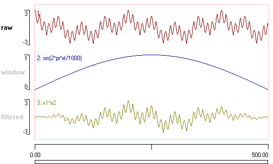
There are several different types of window available that can be chosen from the drop-down FFT window list in Dataview, but the default Hamming is often a good choice. You should consult a book on digital signal processing for information on the pros and cons of the different window types (note that the Rectangular window is actually no window at all – just the FFT applied to normal data with a sharp transition at the edges).
Overlapping
One problem with windowing is that you “throw away” data at the edges of each segment sent to the FFT routine as they taper away towards zero. However, you can to a certain extent both have your cake and eat it in terms of averaging for noise reduction while still maintaining time resolution. You can overlap successive episodes of FFT to reduce the amount of data required to achieve a certain number of averages. This partially recovers the data attenuated due to windowing, and has the added benefit of allowing greater frequency resolution for a given length of data. Obviously, because there is redundant information in the overlapped data, the noise reduction is less than with non-overlapped analysis, but the drop in noise reduction is not as great as might be expected, and the increase in time resolution can be very helpful. Averaging K episodes with 50% overlap reduces the variance by (9/11)K, as opposed to reducing it by K with no overlap (Press et al., 2007). By default Dataview uses an overlap of 50%, but you can experiment with different values selected from the Percentage overlap drop-down list.
Samples and Time Bins
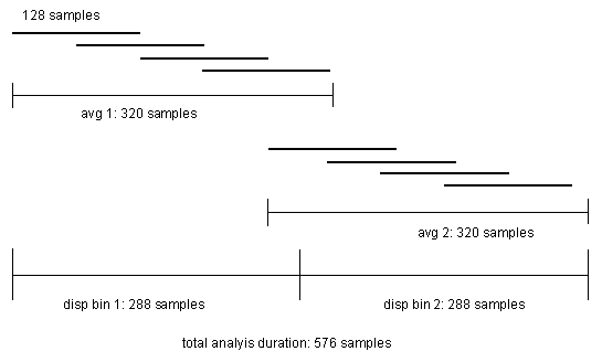
A spectrogam is produced by combining a sequence of individual power spectrum estimates each with a specified duration. This duration determines the time bins of the X axis of the graph. At first sight it would seem that the time bin duration would be the same as that for a simple Power spectrum, and that each time bin would be calculated using a set of samples that was separate from the others. However, this is not the case if FFT episodes are overlapped since the boundaries between time bins are "smeared" by the overlapping data. The diagram below illustrates the sample distribution within a spectrogram where the Frequency resolution is 64, the Percentage overlap is 50%, the Number to average is 4, and Number of time bins is 2.
With this background information we can now look at the analyses in action.
Power Spectrum
The power spectrum of a signal gives the power of the signal within a number of equally-spaced frequency bands from 0 Hz (DC) to the Nyquist frequency (half the sampling frequency). The number of frequency bands (the resolution) is set by the parameters of the analysis method, but is ultimately limited by the duration of the signal.
- Open the file power spectrum.
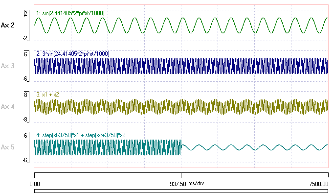
The data were constructed using the expression parser within Dataview, and consist of two sine waves in various combinations. You can see the formulaeNote these formulae come from an earlier version of DataView. Consult the help file for information about formula syntax for the current version. used to construct the data in the trace labels. The frequencies were chosen to match the centres of the frequency bands resulting from FFT analysis. These depend on the Nyquist frequency of 2 KHz, which in turn depends on the nominal ADC sample rate of 4KHz).
Note that the amplitude scale is different between traces. The signal in trace 1 is smaller than that in the other traces.
- Select the Analyse: Spectrum, Cross-spectrum, Coherence menu command to open the Spectrum, Cross-spectrum, Coherence analysis dialog.
As its name suggests, this dialog allows power spectrum (self-spectrum), cross-spectrum and coherence analysis. The latter two consider the power-frequency relationship of two channels of data simultaneously, but we will start with the default Spectrum option, which just analyses a single channel.
The spectrum analysis processes as much of the data displayed in the main view as will fit within the power-of-two sample number constraint. On start-up the default settings are adjusted to maximize the Frequency resolution available from the data with 50% overlap and an Average of at least 4. The user can then adjust the resolution and overlap if desired, but cannot directly set the average since this is constrained by the other values and will always be the maximum possible. In this case the main Viewport is 7500 ms, which allows a resolution of 4096 frequency bins while averaging 6 FFT episodes. The Time needed (used) for the analysis is 7168 ms.
Now let's look at the results:
- Uncheck the Log Y box.
- Uncheck the Autoscale X box.
- Set the right-hand scale of the X axis to 50.
You should now see a single large spike in power towards the left of the spectrum graph.
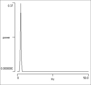
- To the left of the graph at the bottom under the label Maximum (linear), note the read-only Y value of 0.367 and Frequency of 2.441. These show the peak power value in the graph, and the frequency at which this peak occurs.
- Move your mouse within the graph, and note that the frequency and Y value at the current mouse location are displayed in boxes above the boxes showing the Maximum values.
- Look at the text display above the graph. Bin 5 contains the 2.44 Hz power value, which is indeed about 0.37. But also note that there is significant power in the adjacent bins 4 and 6. All the other bins have a trivial amount of power.
- Set the Trace A to 2, and note that the power spike shifts to the right to about 24.4 Hz. This is the frequency of the sine wave in trace 2.
- Set the Trace A to 3, which contains the mixture of sine waves. There are now 2 spikes in the graph. The small one to the left is from the low frequency, low amplitude trace 1 component, the larger one to the right is from the higher frequency, higher amplitude trace 2 component.
- Set the Trace A to 4. This also contains a mixture of sine waves, but the two waves are completely separated in time, rather than being summed together. However, the power output is virtually identical to that of trace 3.
The similarity of the trace 3 and 4 power profile illustrates an important fact about Fourier analysis: within the analysis you completely lose all information about time. In techno-speak, you have moved from the time domain to the frequency domain, and when you gain one set of information you lose the other.
Power values
- Set Trace A back to trace 1, which shows a pure sine wave.
Note that the sine wave has an amplitudeNote that sine wave amplitude is defined as the distance from the mean (0) value to the peak value. The peak-to-peak value of a sine wave with amplitude 1 is 2. of 1, and the mean square value of a sine wave of amplitude 1 is 0.5, so the peak power for trace 1 should be 0.5. But in fact it is about 0.37. Why?
As noted above and from the text output shown above the graph, some of the power in the 2.44 Hz sine wave is leaking into the adjacent frequency bins. If you sum the 3 power values from bins 4, 5 and 6 in the text output you should get a total power of almost exactly 0.5, which is what it should be. The leakage problem in this case is caused by the windowing, which reduces the accuracy of the power location. Normally, this is an acceptable trade-off because the alternative damage caused by spectral leakage is usually worse. But in this particular case, where the pure sine wave frequency has been tuned to fit the parameters of the analysis, it is better not to window the data.
- Select Rectangle from the drop-down FFT window list (which actually means that no window is applied).
- The peak power value jumps up to its correct value of 0.5.
- Set the Trace A to 2, and note that the peak power is now 4.5.
- The amplitude of trace 2 is 3 times greater than trace 1 and so it will have 9 times the power, and 0.5 x 9 is indeed 4.5.
- Set the Trace A to 3.
- You can now see the peaks from both sine waves, and their peak power remains the same (0.5 and 4.5).
- Uncheck the Autoscale Y box, so that the Y axis scales do not automatically adjust.
- Set the Trace A to 4.
- The power locations stay the same, but the actual power drops. This is because each sine wave now occupies only half of the data.
It must be emphasised that with normal biological data containing a wide and arbitrary range of frequencies, windowing is definitely the correct thing to do. Dataview provides a variety of window options, but to be honest, there is not much to chose between them when analysing biological data (as opposed to some physics or engineering problem when specific trade-offs may be important). The default Hamming option is usually perfectly adequate.
The bottom line is that quantitative interpretation of the individual power values is rarely attempted for biological signals. What is usually important is the relative power within the different frequency bands.
Shifting the Viewport
You can change the main viewport, and hence the data supplied for analysis, using the toolbar buttons within the dialogThe navigation tools in the main view are inaccessible because the dialog is modal..
- Set the Trace ID to 4 (if it is not already at that value).
- Click the Expand timebase button (
 ).
).
Two things happen. First, the power returns to 4.5 because only the high-power sine wave is now within the viewport and available for analysis. Second, the Number to average drops from 6 to 2. This is because we have fewer available samples, but have kept the same frequency resolution. Note the non-linearity between sample length and number to average, which is due to the overlap algorithm.
- Click the Expand timebase button again.
We are now warned that we don't have enough data to analyse at this resolution, and the expansion request will be ignored. If we really want to expand the viewport timebase, we will have to manually drop the Frequency resolution.
Zero-padding data
- Click the Show all timebase (
 ) toolbar button, followed by the Compress timebase button (
 ).
).
Now we have run off the end of the data file, and the right half of the main viewport is zero-filled. However, this does not affect the location of the peaks in the power spectrum, it just halves their values, since half the signal now has no power.
In this case nothing is gained from the zero-filled data. However, if a recording is just a bit too short to achieve a particular Frequency resolution, then extending the data by zero-filling up to the next power-of-two constraint may double the frequency resolution, with just a little drop in the numerical values of the peak power. And this can sometimes be quite useful.
Log or Linear Display
It is common in spectral power estimation for the power values to be displayed on a logarithmic scale. This enables low-power components to be visible when on a linear scale they would be completely swamped by the high power components. It also fits with Fechner's law that the human perceived experience of stimulus intensity scales with the logarithm of its actual intensity, rather than linearly.
- Open the file noise 50. This is an intracellular recording that is heavily contaminated with interference at U.K. mains (50 Hz) frequency (you could use the Dataview de-buzz facility to clean up the recording).
- Click the Show all button (
 ) in the main toolbar.
 - Select the Spectrum, Cross-spectrum, Coherence command from the Analysis menu.
- Uncheck and then recheck the Log Y button.
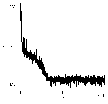
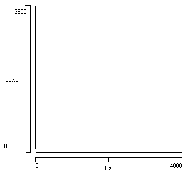
It is obvious that much more detail is visible in the logarithmic display. There is high power at the low-frequency (left) side of the display, reflecting the DC component of the membrane potential. There is then a section of medium power, reflecting the PSPs (and interference) in the recording. There is then a drop to very low power. This reflects the cut-off frequency of the amplifier used to make the recordingThis indicates that the data have been oversampled in terms of meeting the strict Nyquist criterion - there is no information at these higher frequencies. However, to achieve a useful join-the-dots display in the main view oversampling is essential, so this is not a mistake. . In contrast, in the linear display only the DC component and a small adjacent spike are visible.
We can look at the interesting part of the spectrum by zooming in.
- Uncheck the Autoscale X box.
- Set the right-hand X axis scale to 200 Hz.
- Check the grid box to put some markers on the graph.
- Uncheck and then recheck the Log Y button.
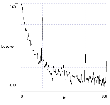
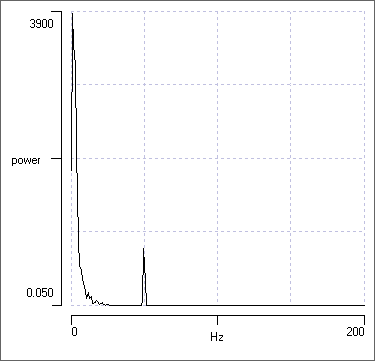
The logarithmic display shows much more detail, but the linear display draws attention to the dominant features of the spectrum. You should chose your display according to what you wish to emphasize.
Cross-Spectrum
The cross power spectral density, or cross-spectrum, is a spectral analysis that gives the power spectral density of two signals combined. The cross-spectrum of a signal pair is the Fourier transform of the pair’s cross-correlation, and is computed as the conjugate FFT of one signal multiplied by the FFT of the other signal. If the two signals are identical, the cross spectrum resolves as the simple power spectrum described above. However, the DataView scaling of the power of non-identical signal pair is different (much smaller) than that of the single-signal power spectrum, and cannot easily be related to the time-domain scaling.
The cross-spectrum is rarely used in biological analysis, but it is provided because it is an important "way station" in coherence analysis, which is descrbed next.
Coherence
Coherence analysis estimates the similarity in power at each frequency band in a spectral analysis applied to two signals, and can thus identify the frequencies at which two variables most strongly covary. It can be regarded as a normalized cross-power spectral density, and its value is always within the range 0-1. CoherenceSometimes called magnitude squared coherence. is calculated thus:
\begin{equation} C_{XY} = \frac{\left\lvert P_{XY} \right\rvert ^2} {P_{XX} * P_{YY}} \end{equation}
where Cxy is the coherence of the signals X and Y, Pxy is the cross spectral density estimate of X and Y, and Pxx and Pyy are the individual power spectral density estimates of X and Y.
Coherence analysis is often used to detect causal relationships between signals. If two signals have a high coherence at a particular frequency, it suggests that either one signal is driving the other at that particular frequency, or that both are driven by some third, unmeasured, signal.
- Open the file coherence.
This is a file of data constructed to illustrate some key features of coherence analysis. There are 6 traces whose contents are as follows:
- Sine wave amplitude 1, frequency 1000 Hz plus sine wave amplitude 10, frequency 700 Hz plus standard Gaussian white noise.
- Cosine wave amplitude 1, frequency 1000 Hz plus cosine wave amplitude 10 frequency, 700 Hz plus standard Gaussian white noise.
- Standard Gaussian white noise
- Cosine wave amplitude 1, frequency 1000 Hz plus standard Gaussian white noise
- Sine wave amplitude 1, frequency 1000 Hz plus sine wave amplitude 10, frequency 700 Hz.
- Cosine wave amplitude 1, frequency 1000 Hz plus cosine wave amplitude 10 frequency, 700 Hz.
The data thus consist of white noise (except traces 5 and 6) , plus sine-shaped waves with frequency 1000 and 700 Hz, in various combinations of amplitude and phase. The formulae used to construct the data are displayed as trace labels.
- Select the Analyse: Spectrum, Cross-spectrum, Coherence command to open the analysis dialog in the default Spectrum mode.
- Uncheck the Autoscale X box, and set the maximum frequency in the graph (right-hand X axis) to 2000 Hz.
Note the two peaks in the power spectrum for the default trace 1, reflecting the 700 and 1000 Hz sine waves, and note that the 700 Hz peak has more power, reflecting its 10-fold greater amplitude.
- Repeatedly click the up-arrow spin button of Trace A to look at the power spectrum of each trace in turn. Make sure you understand how the spectrum reflects the composition of the trace as described above.
- Switch Trace A back to 1 and select Coherence from the Mode options.
- Trace B is preselected as 2, so the analysis shows the coherence between traces 1 and 2.
- Uncheck the Log Y and Autoscale Y boxes.
- Set the bottom Y axis scale to 0 and the top to 1.
- Coherence values range between 0 and 1, so this is appropriate.
- Reduce the Frequency resolution to 256 bins.
- This increases the number of averages from 8 to 38. The importance of this is explained later (see also Averaging above).
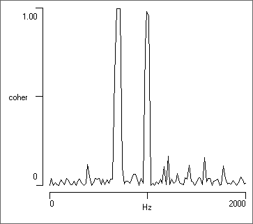
At this point there should be 2 clear peaks in the coherence values, reflecting the 2 sine-shaped waves of matching frequency in the two traces. Note that the waves in trace 2 are cosine waves, and so have 90° phase difference to those in trace 1, but that this does not reduce the coherence - coherence is phase-insenstive. Also note that the 1000 Hz wave has a 10-fold lower amplitude than the 700 Hz wave, but a similar coherence value near 1. Coherence is not completely insensitive to amplitude, but if there is a strong match in frequency (as in this artificial data), the coherence value will be high even for relatively low-amplitude signals.
- Switch Trace B to 3.
Trace 3 is just noise, with no added sine waves. There are no dominant peaks in the coherence trace, although random chance can cause coherence values to rise above the baseline.
- Switch Trace B to 4.
There is high coherence at 1000 Hz because a sine-shaped wave of that frequency occurs in both traces 1 and 4. There is a large-amplitude sine wave at 700 Hz in trace 1, but no equivalent wave in trace 4, so there is no peak in coherence at that frequency.
Importance of Averaging
- Increase the Frequency resolution to 4096 bins by repeatedly clicking the up-arrow of the spin button.
As you increase the frequency resolution, the number of data segments available to contribute to the average decreases, and there is an increase in the non-peak random coherence values (i.e. the values outside the 1000 Hz band). When your reach a resolution of 4096 bins the Number averaged has dropped to 1, so no averaging occurs. The coherence now has a value very close to 1 at all frequencies!
The take-home message is that for coherence analysis to have reasonable accuracy it is essential that there are sufficient data to allow averaging to take place, and the analysis parameters must be such as to allow this to occur. You must not be too greedy in seeking high frequency resolution at the expense of averaging!
Statistical Significance
There are many "lumps and bumps" in the coherence values in the non-coherent frequencies. If we did not know the formulae used to construct the data, how could we tell if any of these were significant?
According to Biltoft and Pardyjak (2009), the threshold value for coherence significance can be determined from the F statistic, where the degrees of freedom depends on the number of data segments contributing to the average:
\begin{equation} C_{1-p} = \frac{2F_p}{n - 2 +2F_p} \end{equation}
where C1-p is the critical coherence level (and p is 0.95 or 0.99), Fp is the upper tail critical value of the F(2, n-2) distribution and n is the number of segments in the average.
However, this equation was derived for use in a situation where the data segments were independent measurements, and if we overlap segments in calculating coherence, they are definitely not completely independent. I am not aware of any statistical test that takes account of overlapping, so it is best to remove the overlap.
- Set the Frequency resolution back to 256.
- Reduce the Percentage overlap from 50 to 0.
- This makes the data segments more independent, but reduces the number of segments in the average from 38 to 19 and consequently increases the level of non-coherent values.
- Check the Significance box at the bottom of the Analysis parameters group.
- Previously, this box was disabled because we had overlapping segments.
The Critical level for coherence is shown as 0.418, and this level is drawn as a red horizontal cursor in the graph. There is (in theory) only a 0.01 probability that any coherence value greater than this could have arisen by chance. The coherence value of 0.987 between traces 1 and 4 at 1000 Hz is clearly significant!
- Set Trace B to 3.
Trace 3 contains nothing but noise, and should have no coherence with trace 1. However, one of the coherence peaks just crosses the 0.01 probability threshold. None-the-less, it would be unwise (in fact, wrong) to interpret this as strong evidence for coherence at this frequency.
- Reduce the Frequency resolution to 128.
- Now increase the Frequency resolution to 512.
With both these adjacent resolution bands, there are no coherence values that cross the critical threshold. It appears that the 256 bin resolution just hits the opposite of a sweet spot, and the one-in-a-hundred chance actually happens.
Importance of Noise
- Remind yourself of the initial coherence:
- Set the Frequency resolution back to 256.
- Look at the coherence of traces 1 and 2.
- The data should now look like the figure above.
- Now look at the coherence of traces 5 and 6.
Traces 5 and 6 have identical sine wave components to traces 1 and 2, but there is no added noise. The coherence graph looks totally different, with a wide spread of high-value coherence across a range of frequencies. What is going on?
With identical pure sine waves occurring in two traces, the power spectra of the two traces will also be identical. Furthermore, unless you are very lucky with the frequency of the waves, there will inevitably be spectral leakage into frequency bins on either side of the peak "true" frequency (you will have seen this when you looked at the spectra of traces 5 and 6 earlier). There will thus be identical very small but non-zero power across a spread of frequencies outside of the peaks. Since coherence is normalized and relatively insensitve to amplitude, these small but identical values will have a high coherence, hence the wide spread in the graph. However, if you have noise in the system, the power in the noise (which is incoherent) will swamp the power in the spectral leakage, and the peaks at the coherent sine wave frequencies become dominant. So the take-home message is that the existence of noise in signals is important in coherence analysis. Fortunately, noise is an inevitable presence in most real measurment systems.
Spectrogram
Like the standard power spectrum described above, spectrograms analyse just a single channel of data. However, spectrograms show how the power in each frequency band varies over time. Spectrograms are frequently used to analyse sounds such as speech or bird song. We will look at a different type of sound:
- Load the file killer whale. This shows the vocalization of a killer whale recorded with an underwater microphone. It started as a standard Microsoft wav file, and was then converted to DataView format.
- Select the Analyse: Spectrogram menu command to call up the Spectrogram dialog box. By default the visible display region (in this case the entire file) is analysed. If you wanted to just analyse a subset of the visible display, put 2 vertical cursors to delimit the area of interest.
- If you have a sound system connected to your computer, click the Play button near the bottom-left of the dialog. Enjoy!
The dialog is quite complex and what follows is only a brief description. If you want more details on a particular option, press F1 on your keyboard to call up the context-sensitive help.
On the right of the dialog are two graphical displays. The large coloured display is the spectrogram itself – the result of the analysis. The horizontal axis is time, and you can see that it is quite “blocky”. In essence, each block represents the result of a FFT analysis on a sequential chunk of data. The number of blocks is set by the Number of time bins. The vertical axis is frequency, with high frequencies at the top and low frequencies at the bottom. Again, the display is “blocky”, and each block represents a frequency band. The number of bands is set by the Frequency resolution (and is constrained to be a power-of-two). The colour of each block in the display reflects the power of the signal within that time and frequency block. The accuracy of the power is largely set by the Number to average, with higher values giving more accurate results. These parameters all interact with each other, and increasing any of them requires more data for analysis. The details of these parameters were described earlier in the Fine-tuning the Analysis section.
- Click the up spin-button to increase the Frequency resolution to 128. Note that the analysis now reads beyond the end of the file, and zero-pads the data.
- Reduce the Number to average to 2. We are now again analysing data rather than zeros, but the variance of the power will have increased.
- Increase the Percentage overlap to 75% by selecting it from the drop-down list.
- You can now put the Number to average back to 4, to analyse the full song.
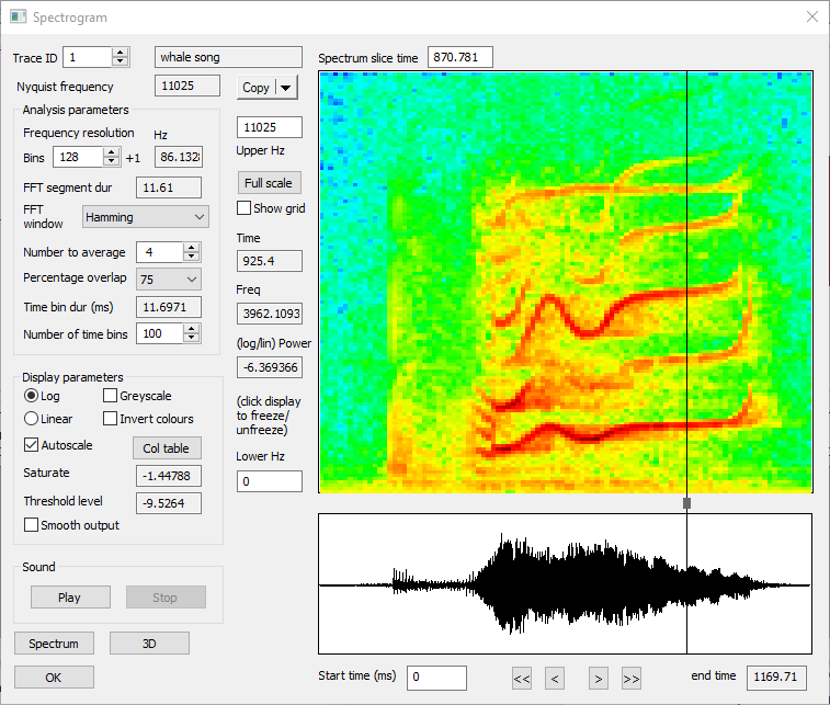
If you move the mouse over the spectrogram display, the time, frequency and power values at the mouse location are shown just to the left of the display. These values change as you move the mouse. If you want to freeze the read-out (perhaps to copy the numbers to the clipboard), just click the mouse. Click again to un-freeze the display.
Below the spectrogram is a smaller display showing the section of data that is being analysed. The Start time (which is relative to the whole data file) can be adjusted here if desired, either by directly editing it, or by using the adjacent buttons. The end time is read only, since it is determined by other settings. If you had a multi-trace file (which this one isn't) you could set which trace is analysed by changing the Trace ID parameter at the top left of the dialog.
Standard power spectrum
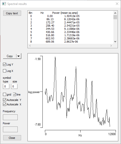
You can produce a standard power spectrum (as described previously) for any region of interest in the spectrogram.
- Drag the scrubber (the small block between the spectrogram and raw data displays) to the approximate location shown in the figure above.
- Click the Spectrum button.
You should now see the display in part (b) of the figure. Note the power spikes occur in the frequency bands of the horizontal redish bars under the scrubber in the spectrogram.
Analyse your own voice
If you have a microphone input on your computer, it might be fun to have a look at a spectrogram of your own voice.
- Select the File: Record/stimulate: Microphone input menu command.
- Click Start in the Mic/line data acquisition recording window, then say the words "low, high", then click Stop.
- Click Save to write your recording to a dtvw-rec file. The file will load automatically once it is saved.
- Select the File: Close menu command to close the recording window.
- Your voice recording should now become the active file. Click the Show all (
 ) toolbar button.
 - Select the Analyse: Spectrogram menu command.
- Click the Linear choice so that you emphasize the main power components.
- Set the Upper Hz value to 1500 to zoom inThe actual value will auto-adjust to the nearest FFT boundary. on the lower frequencies (if you are female, you may need to set a higher value).
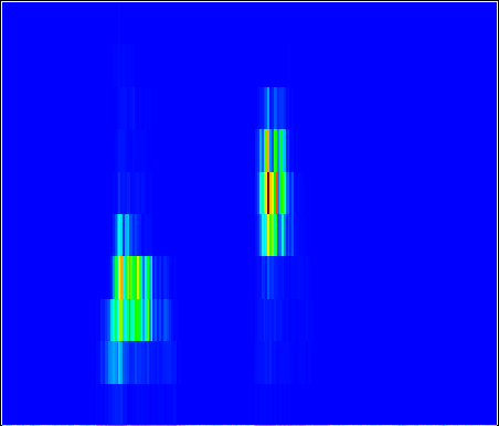
You will (probably) see that the spoken word "high" has power in higher frequency components (is further up the display) than "low". This is not a result of some deep AI intelligence about the meaning of the words(!) - it's that the vowel sound in "high" is more squeaky than that in "low". In the unlikely event that you want to hear me, the file is my voice.
Spectral analysis within events: fly song
What can you do if the activity that you want to analyse occurs in relatively short bouts, and these are interspersed with activity with rather different characeristics? One solution is to delimit the regions with one type of activity by events in one channel, and the regions with the other type by events in another channel, and then to analyze the two channels separately.
- Load file fly song. This shows the song of a fruit fly.
- If you have sound on your computer, select the Sound: Play menu command.
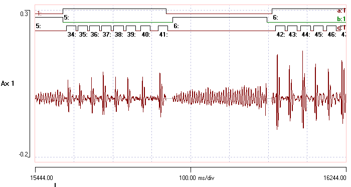
The fly can produce two main types of sound; a burst of clicks which are delimited by events in channel a, and short buzzes delimited by events in channel b. The individual clicks within the bursts are delimited by events in channels c. Silent periods between songs have been made inactive to reduce file size. The aim is to do a separate spectral analysis for the different components of the song.
- Activate the Event analyse: Frequency spectrum command to analyse the regions within events.
- Set the Frequency resolution to 1024.
- Click Analyse to investigate the spectrum within the click bursts identified within event channel a.
The frequency resolution determines the length of the data segments processed by the FFT. The data within each event within the specified event range (from Start at for Count events) are read from file, and segment-length chunks of these data are windowed (i.e. passed through a filter that tapers values at the edges) and then analysed by FFT. Successive segments within each event are overlapped if desired. The power at each frequency is accumulated over the successive segments, and finally the average power for each frequency is reported.
Any data left-over at the end of a segment (including that from events whose total duration is shorter than the segment length) is ignored by default. However, it can be included by checking Pad fragments. In this case, the left-over data is windowed and then the segment is zero-filled to bring it up to the required power-of-two length. This means that genuine data are not wasted and thus the maximum resolution and lowest noise can be achieved. However, the actual value of the power becomes distorted, since the zero-valued data clearly contain no power and so reduce the overall power levels in the averaging process.
With the resolution set to 1024 each FFT process requires 256 ms of data, and with 50% overlap the FFT segments done shows that a total of 102 FFT segments have been analysed from this file.
- Check the Pad fragments box, and note that the number of FFT segments done increases to 179. This is because the program can now make use of short events (fragments) by zero-filling them up to the required length.
- There is not much information in the right-hand side of the spectrogram, so uncheck the Auto scl X box, and set the right-hand time axis to 1500.
- Uncheck the Autoscale Y box so that we can compare power levels more easily.
The spectral density (below, a) reveals a broad power range which peaks at about 170 Hz, but which extends up to about 900 Hz before rapidly decreasing. The latter reflects the setting of the analogue filter on the recording device.
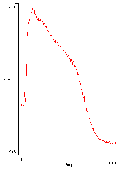
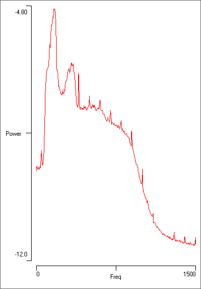
Note that the “clicks” which are visually dominant in the recording and occur at about 30 Hz actually contribute very little to the total power. This is because they are swamped by the high-frequency ups-and-downs within each click. To analyse the clicks themselves:
- Select the Event Analyse: 2-D scatter graph menu command.
- Set the Chan 1 to c. The default frequency vs time graph shows a dominant band at about 30 Hz which is caused by the clicks.
- Dismiss the Scatter graph to return to the Spectrum dialog.
- Now change the Event channel to b to look at the buzz sections of data.
- Click Analyse again.
This time the peak at 170 Hz is much more prominent (above, b), reflecting the more consistently dominant frequency in the “buzz” part of the song. There is also a broader harmonic at about twice the dominant frequency. However, there is less high-frequency power than in the “click” sections of the recording. There are very sharp peaks at regular intervals of 100 Hz; these are almost certainly caused by mains interference in the recording.
- Finally, set the Event channel to c and click Analyse.
- Uncheck and then re-check the Include fragments box.
In this channel the events are tightly focussed around the individual clicks, and each event is only 25 ms long. The FFT requires 256 ms of data, so for this event channel it is essential to Include fragments since none of the events are long enough to provide a full segment of data for FFT analysis. But with 700 events there are enough data to provide a reasonable average. The frequency profile is very similar to that of channel a, but the overall power levels are lower because of all the zero-filling.
Carrier frequency
The frequency with the highest power level in a spectrum is known as the carrier frequency. You can find the carrier frequency for each event in a channel using the Scan events facility. The frequency is stored within the variable value associated with the event.
- Analyse Event channel a again.
- Click the Scan events button.
- Call up the Event channel properties dialog box from the Event edit: Event channel properties menu command.
- Select Carrier frequency from the Numeric display per event drop-down list.
- Click OK (or Apply) in the Properties dialog box.
Note that each event in channel a in the main display now has a number associated with it. This is the carrier frequency of the data within that event. The carrier frequency of each event can then be retrieved through the various event parameter options (graph, histogram, list etc).