Contents
Stimulus-response analysis
Peri-stimulus time histogram (PSTH)
Joint PSTH
Evoked potentials
See also ...
Stimulus-Response Analysis
This section deals with stimulus-response analysis in which the time of the stimulus can be marked by a point-process event. This is appropriate for stimuli which are themselves very brief, like electrical pulses, or pre-synaptic spikes. It may not be appropriate for stimuli that occur over an extended time, such as a olfactory signal or a sound tone, unless that extended time can be reduced to a single point such as its onset time, or peak intensity.
There are two types of analysis. Histogram-based analysis is used if the response as well as the stimulus can be marked by point-process events. Waveform-based analysis is necessary if the response takes the form of a continuous change in a signal, such as an evoked potential.
Peri-Stimulus Time Histogram (PSTH)
The peri-stimulus time histogram is the standard way of displaying the relationship (if any) between a stimulus and response when both parameters can be regarded as point processes in a time series – for example, the time of occurrence of spikes in a pre-synaptic neuron (the stimulus) and spikes in a post-synaptic neuron (the response).
- Load the file psth.
These are simulated data (constructed in Neurosim) in which a pre-synaptic neuron (trace 2, spikes marked by events in channel b) makes an excitatory connection to a post-synaptic neuron (trace 1, spikes marked by events in channel a). The pre-synaptic neuron was stimulated to spike by an external current pulse once every 5 seconds. The post-synaptic neuron shows background spikes due to random input, but the pre-synaptic neuron is silent unless stimulated.
- Activate the event histogram dialog through the Event analyse: Histogram/statistics menu command
- Select PSTH 1 from 2 from the drop-down Parameter list
- The default values of event channel 1 (Resp) as a and event channel 2 (Stim) as b tell the histogram where the stimulus and responses are marked, and are correct for this file.
- Set the right-hand x axis to 2000 and the left hand x axis to -500, and the bin count to 20.
- Check the Draw expected +/- 99% confidence box.
This draws confidence intervals assuming that response events follow a Poisson distribution. Press F1 for details. - Check the bootstrap box.
This replaces the theoretical confidence intervals with ones based on 1000 repetitions of the analysis with random re-sampling of the response times on each run. (The number of repetitions can be adjusted through the File: General options menu command.)
You should now see the image below:
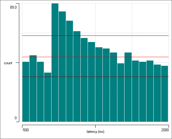
There is clearly an increase in the probability of spiking in the post-synaptic neuron immediately following a pre-synaptic spike.
Normalized Plot
- Select Avg PSTH from the Y axis scaling drop-down list.
- Uncheck the Autoscale Y box.
- Set the top Y axis scale to 6.
The plot now shows the per-stimulus average count in each bin, with the standard deviation of the average shown as a vertical blue line. Thus the background spike average, as indicated by the pre-stimulus bins, is about 2.5 spikes per 125 ms (the bin width), which rises to about 4.5 spikes in the 125 ms immediately following each stimulus.
Raster Plot
The histogram combines all the responses into a single display, but sometimes it is useful to see individual responses in more detail.
- Select the Event analyse: Stim response latency raster command.
- Set the Stimulus channel to b and the Response channel to a.
- Set the left-hand x axis (latency) to -500 and the right-hand to 2000.
The display parameters now match those of the histogram. Each row represents a trial, i.e. a spike in the stimulated pre-synaptic neuron, while within each row each response spike in the post-synaptic neuron is marked by a small vertical bar. The width of the bar can be adjusted with the Line size parameter. The increase in spiking in the response neuron shortly after the stimulus is clearly visible.
- Hover the mouse over the display and note that a readout of the stimulus and latency at the mouse location is shown at the bottom.
- Click a response bar, and note that the response nearest the click point is centred in the main view.
The response in the mid part of the display is shown in red because the corresponding response events (in channel b) have been edited to have a red colour, and the Colour: From events option is selected by default. The colour is completely meaningless in this case, but colouring could be used to highlight a particular experimental condition applying to those responses, such as drug application. If you select Colour: Choose, the display is shown in the Target colour (this does not affect any colours applied to events). To change the Target colour, just click the coloured button.
You can select responses by clicking Sel and then dragging the mouse around them. If you control-click Sel, the selection is constrained to a rectangular shape, and can be adjusted after definition by dragging a corner or edge. The events representing selected stimulus-response pairs can then be tagged (click Tag) or coloured with the Target colour (click Colour sel). You can also List the numerical values of the stimulus-response pairs.
List Counts
It may be useful to get a simple count of response events within a certain time window after each stimulus.
- Select the Event analyse: List evoked counts menu command to open the Evoked events dialog.
- Set the Post-base search time to 500 ms.
The Evoked response counts list in the dialog shows the number of events in a 500 ms window following each stimulus event. However, note that with the current file, not all of those events will actually have been evoked by the stimulus, since there is a certain level of spontaneous background spiking.
Joint Peri-Stimulus Time Histogram
The joint peri-stimulus time histogram (JPSTH) is is a rather specialized form of analysis that looks for connections between two neurons, when both of them are strongly influenced by activity in a third. In standard analysis, the effect of the third neuron may obscure any influence that the other two may have on each other. The JPSTH procedure separates out the influences, and is described here.
Evoked Potentials
An evoked potential is any neural waveform produced in response to (i.e. evoked by) an external stimulus. In clinical neuroscience the term is used mainly for electroencephalographic responses to visual, auditory or touch stimuli. In non-clinical neuroscience the potential may simply be a PSP recorded in a single neuron. Individual evoked responses are often embedded in a lot of noise and may have to be enhanced by signal averaging in order to be detected (although not in the following example).
- Load the file evoked PSP.
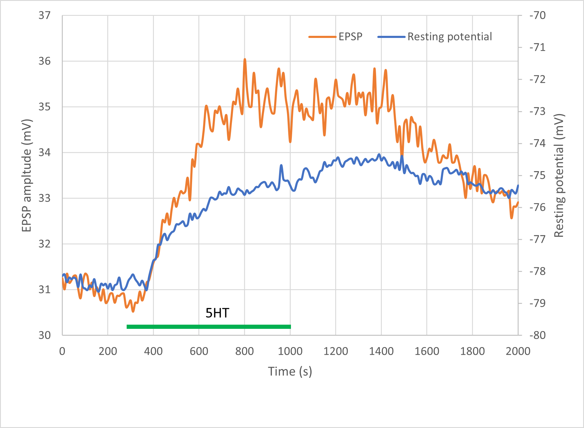
The recordingThe recording is from a fast flexor (FF) motorneuron in the third abdominal ganglion of a crayfish. The first root was stimulated with extracellular electrodes to elicit a spike in the segmental giant (not shown), which then generates a mixed electrical/chemical EPSP in the FF. shows EPSPs generated in a neuron in response to a series of extracellular stimuli. The original data were collected using the CED Signal program, but the file has been saved as a native Dataview file and edited to remove details not needed for this tutorial. There are 201 frames (sweeps) in total, and the start of each frame is marked by an event in channel a. Each frame is 35 ms in duration and shows a single stimulus and the evoked EPSP (indicated by annotations in frame 2). The frames were recorded at 10 sec intervals, but are displayed contiguously in the file, so the start and end times on the X axis do not reflect the real elapsed time of the experiment.
Serotonin (5HT) was applied after about 5 minutes, and then washed off about 10 minutes later. The application and wash times have markers.
- Press control-m on your keyboard to navigate to the first marker, for 5HT application, at frame 32.
- Press control-m again to navigate to the next marker at frame 101, when the wash started.
- Go back to the earlier application marker by pressing alt-m.
- Alternate between the two markers a few times, and note that the EPSP amplitude and baseline membrane potential changes between them: 5HT may have an effect!
- Click the Show all toolbar button (
 ).
).
There is definitely a change in membrane potential, but the EPSP is hard to see because of the dominant stimulus artefact.
Now we will look at the evoked response in detail.- Return the main display to its original timebase by setting the end time (right-hand X axis scale) to 70 ms.
- Activate the Event analyse: Event-triggered scope view command.
- Set the Dur to 35 to see the complete recording frame in each sweep.
- Change the Count to -1 to show all the sweeps.
Colour event sequence
- Select the from Sequence option in the Sweep Colours frame of the Scope view.
This causes sweeps to be coloured according to their position in the event sequence.
- Click the Seq map button to see the relation between the colour and the position in the sequence.
The first event is blue, while the last event (-1) is dark red. - Dismiss the sequence map.
- Set the Scope view Start time to 2 ms and Sweep duration to 12 ms. This zooms in on the evoked response.
The Scope view should now look like this:
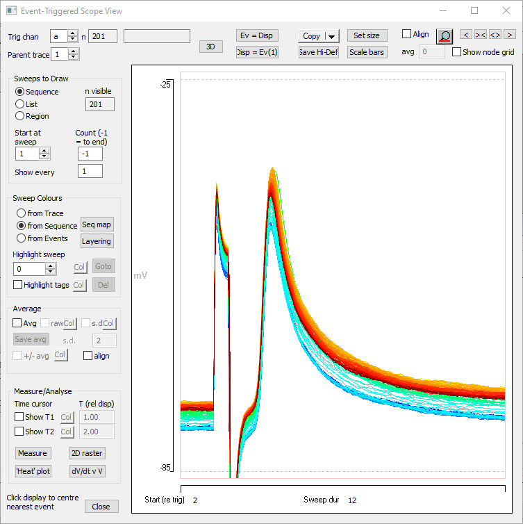
The sweep colours indicate that the neurone depolarises during the experiment, although the darkest red is below the peak depolarization, indicating slight recovery towards the end of the experiment.
Raster Display
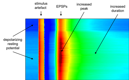
Another way of viewing the time dependence of changes is with a colour-coded raster display.
- Click the 2D raster button near the bottom-left of the Scope view to open the 2D Intensity raster dialog.
This shows a display in which each row is a sweep (earliest at the top), each column is a time bin, and the colour maps the amplitude of the signal. Adjusting the settings will reveal more detail.
- In the 2D raster dialog, uncheck the Autoscale box, and set the Threshold value to -80 and the Saturate level to -40.
The raster plot should now look like this:
- Close the raster display.
Align baselines
It is very clear from the preceding analyses that the neuron depolarises after applying the drug, but it is not immediately obvious whether the EPSP changes amplitude, or simply shifts positive.
- In the Scope view, check the Align box near the top right, and set the avg to 1.
This offsets each sweep after the first so as to have the same average potential over the first 1 ms as the first sweep has, i.e. it aligns the baselines. It is now obvious that the relative amplitude of the EPSP first increases, then decreases, independently of any changes in resting membrane potential.
Note that the alignment only occurs within the Scope view display - the underlying data are untouched.
Measure potential
Now we are ready to measure the membrane potential and EPSP peak amplitude.
- Check the Show T1 near the bottom-left of the Scope view and set the adjacent T (rel disp) to 3.35 ms.
- Check the Show T2 box and set its T (rel) to 0.6 ms.
Red and blue cursors should now be visible in the Scope view, with the red cursor aligned with the peak of the EPSP and the blue cursor in the pre-stimulus region where the membrane potential is at its resting level. If necessary, these cursors can be dragged in the view to get them into the right location.
- Click the Measure button in the Scope view to display the Measure data in display dialog.
The Measurement Time 1 and Time 2 values are read from the cursors, but can be edited here too. - Click the Measure button in the Measure dialog.
The Measure output window becomes populated with values measured from the Scope view at the designated cursor times. - Click Copy in the Measure dialog to place the measurements on the clipboard. They can then be pasted into an external program if further analysis is desired.
- Close the Measure dialog.
Important note: This procedure works because the time of the peak of the EPSP is almost constant relative to the start of each recording sweep, and so a single cursor location can measure all peaks simultaneously. If it varied, a more elaborate process would be necessary. E.g.
- Measure the resting membrane potential as described above and copy it into Excel.
- Make a new event channel with events that encompass just the EPSP peaks.
- Use the Event edit: Logical operation: EQUAL (Copy) menu command to copy the trigger events in channel a into a new channel (e.g. b).
- Set the Trigger channel in the Scope view to b.
- Change the Start (re trig) and Sweep duration to encompass all the EPSP peaks, but exclude the stimulus artefact.
You could also- Click the Magnify horizontal toolbar button
 () in the Scope view (not the main view).
 - Drag the mouse across the region of the Scope view display that includes the EPSP peaks, but excludes the stimulus artefacts.
- Click the Magnify horizontal toolbar button
- Click the Ev = Disp button at the top of the Scope view.
Events in channel b should now encompass all the EPSP peaks, but exclude the preceding stimulus artefact.
- Select List/save event parameters from the main menu to open the Event Parameter List dialog.
- Set Event channel 1 to b.
- Set the Parent trace to 1.
- Check the ID box (you can also uncheck the On time box, although you could leave it checked and just ignore that output).
- Check the Maximum val, time box.
- Click the List button.
- Copy the List output and paste it into Excel, making sure that the ID numbers match those from the Scope view measurement per row.
- Use Excel to calculate the maximum value minus resting potential to arrive at the EPSP size.
Average evoked potentials
You can average sweeps in the Draw/Average/Measure dialog box display by checking the Avg box, but it would be nice to have separate averages for control (pre-drug) and experimental potentials.
- Set the Start at sweep to 12, and the Count to 20.
- Uncheck the Align box.
- Check the Avg (average) box.
The display now shows the average waveform of 20 consecutive sweeps starting at sweep 12. - Click the Save avg button (only enabled when average is selected) and choose a file name.
Note that when the new file loads it becomes the active view and the Scope view automatically looks to it for data. It has no events, so the Scope view is blank.
- Make the original Window showing the evoked psp file active by clicking in its title bar (or selecting it from the Window menu).
Note that the Scope view switches back to the new active window. - In the Scope view set the Start at sweep to 82. We are now seeing the average waveform of 20 EPSPs during drug application.
- Click Save avg, and choose a different filename.
Combining traces from different files
We now have 2 files, showing the average of the EPSP before and during drug application. To facilitate comparison, it would be nice to combine these into a single file.
You can easily import traces from one file to another so long as both files are open in the same instance of DataView and so long as they both have the same sample time and the same number of samples per trace.
- Dismiss the Scope view. The 2 average files should be displayed in DataView.
- Make the first file that you saved the active view by clicking on its title bar or selecting it from the Window menu.
- Select the Transform: Import trace command.
In the middle of the Import trace dialog box you should see a list of files that are compatibleTo be compatible for import files must have the same sample time and the same number of samples per trace as the file to which they are being imported. with the active view, including the other file that you saved (assuming that you did not shut them down after they loaded). - Select this file by clicking on it, note that by default 1 is already entered into the Traces to add edit box (which is what we want), so click OK. Enter a new file name.
When the new file loads it should have 2 traces in it. To compare the traces directly it is useful to place them on a single axis.
- Select the Traces: Format menu command to show the Trace format dialog.
- In the Axis frame, deselect Show for axis 2. In the Traces frame, enter 1 into the axis box for Trace 2. You can also give the traces different colours if you wish.
- Click OK.
The two averaged traces are now superimposed on axis 1.
Align baselines
To compare the relative relative amplitudes of the EPSPs it would be useful to remove the DC baseline shift caused by the drug.
- Place two vertical cursors at the left hand end of the screen, in the pre-stimulus region of the record. These demarcate the region that will be used to measure the average baseline value.
- Select the Transform: Align trace baselines command.
- Leave the Master trace ID as 1, and enter 2 into the Traces to align box.
This means that trace 2 will be offset so that its data values between the two vertical cursors will have the same the average value as the average value of the master trace between the cursors.
Click OK and select a filename.
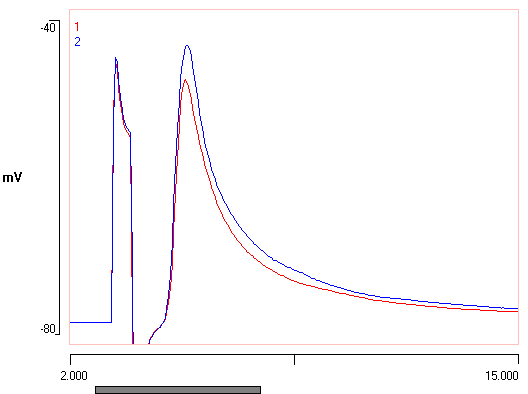
When the new file loads, note the two traces now have their baseline membrane potentials aligned. After scaling adjustment, the data might look like this:
Important note: This alignment procedure has changed the actual data within the file (unlike that in the Scope view described earlier), and so needs to be carefully documented.
See also ...
Event cross-correlation analysis.