Phase-plane analysis
Most data visualization in neuroscience involves plotting a time-dependent variable such as the membrane potential against time itself. However, in phase-plane analysis, one time-dependent variable is plotted against another time-dependent variable. This provides an alternative visualizationIn dynamical systems analysis the state variables of the underlying differential equations are plotted against each other. This provides more than just an alterative visualization - it allows mathematical investigation of features such as system stability. However, this is more used in computational than experimental neuroscience, and is beyond the scope of this tutorial (and this author). of the shapes of features such as spikes or PSPs, typically by plotting the membrane potential (V) against its time derivative (dV/dt) at each moment in time over the duration of the feature. The phase-plane plot can reveal subtle changes in shape over time that are difficult to pick up in an extended record.
-
Load file chirp.
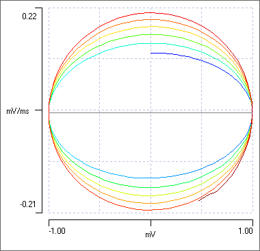
This shows a sine wave with constant amplitude but continuously increasing frequency (the trace label shows the formula used to generate the waveform). - Select the Analyse: Phase-plane menu command to display a phase-plane plot of the data visible in the main view. (Note that you can re-size the phase-plane dialog by dragging on one of its edges with the mouse.)


The phase plot shows a line that spirals clockwise and is colour-coded for time, with blue being earlier, red being later. At the earliest time the main view shows that the membrane potential is 0, but the rate-of-rise of the sine wave is maximal (for that frequency), so the bluest phase plot point is in the middle of the X axis, representing 0 voltage, but above the middle on the Y axis, representing a positive rate of change (voltage derivative: dV/dt). As the sine wave climbs to its maximum, the phase plot moves rightwards indicating increasing voltage, but downwards indicating a decreasing derivative. At the peak of the sine wave the derivative is zero. Thus the maximum and minimum on the X axis (mV) of the phase-plane represent the peaks and troughs of the sine wave, and at these voltages the value on the Y axis (dV/dt) is zero. The sine wave has constant amplitude, so the X maxima and minima stay the same. The the maximum and minimum on the Y axis represent the most rapidly changing voltages, which occur when the sine wave itself crosses the zero value. However, the sine wave is a chirp of increasing frequency, so the Y maxima and minima increase with each cycle. Hence the spiral.
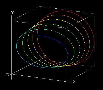
The phase progression can be seen more easiy in 3D:
- Click the 3D button to display a 3D phase-plane plot in which the Z axis is time and the sine wave displays as a spiral.
- You can rotate the 3D graph by dragging on it with the mouse.
- Click the Front button to get a display equivalent to the standard 2D display.
- Click the Default button, and then check the Auto Y option to see the graph rotate.
- Now dismiss both the dialog boxes in turn.
What do real neurophysiological data look like?
- Load the file spike shape.
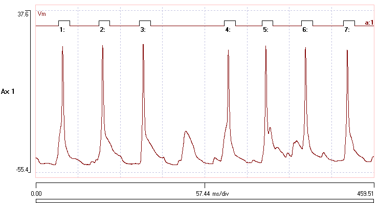
- In the main view, set the Start time to 250 and the end time to 280 ms to zoom in on an EPSP which generates a spike.
- Activate the Analyse: Phase plane menu command as before.
Follow the line clockwise from the blue to the red end. The line first moves to the right, indicating depolarization, and then back to the left, indicating hyperpolarization. There is an initial small hump which is generated by the EPSP. The EPSP almost flattens out at its peak, which is why the hump is hump-shaped! - the derivative almost returns to zero at the flattish top of the EPSP. Then the spike takes off. The maximum rate of rise is about 51 mV/ms, which occurs when the spike has a membrane potential of about -8 mV (you can see the values in the X and Y readouts when you hover the mouse over the plot). The spike peaks at about +15 mV, when the derivative is 0. are two loops visible in the plot. The maximum fall rate is about -26.5 mV/ms, which occurs at a membrane potential of -3 mV.
- Click the show all button (
 ) in the dialog toolbar.
 - Try to move the phase plane dialog so that it does not obscure the main display.
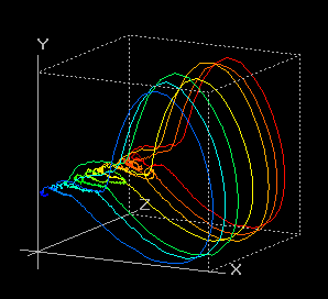
- Click the 3D button.


The phase plot is now generated from all the data in the file. The 7 large loops represent the 7 spikes displayed in the record. The small loops at the left represent subthreshold events. The EPSP underlying the single spike failure is the largest of these small loops, drawn in green-yellow (rotating the graph will help visualize this event). The main display shows that the 1st and 4th spikes take off rather late in the PSP, and the blue and yellow loops in the phase plane initially follow the failure trajectory, but just manage to make threshold. A small orange loop is visible in the 3D display, and this is caused by the small EPSP following immediately after the 5th spike in the record.
You can visualize these subthreshold events more clearly by zooming the 3D display.
- In the 3D dialog, click the Sel button, and drag around the region of interest in the graph. This should be now be enclosed by a white line that follows your drag path.
- Now click the Zoom button, and the scales of the display change to zoom in on the selected region. In the zoomed view it is apparent that several PSPs are visualized as small loops in the phase-plane.
- To return to the full view, re-check the Autoscale boxes (which become unchecked during zooming).
- Close both dialogs.
Event-specific analysis
Dataview allows phase-plane analysis of discontiguous sections of data if they are defined by events. This can be useful if the regions of interest are widely dispersed in a recording - it avoids the computational expense of dealing with unimportant data.
The file file spike shape already has suitable events in channel a that were defined using simple threshold-crossing.
- Activate the Event analyse: Event triggered scope view menu command.
- Click the Disp = Ev (1) button near the top-centre of the dialog.
You should now see the 7 spikes in the recording. - Click the dV/dt v V button near the bottom-left of the dialog.
The phase plot is similar to the one from the whole recording, but it only includes data within the events.
- Dismiss the Phase plot dialog.
- Check the Avg (average) box in the Scope view dialog.
You now see the point-by-point average waveform of the 7 spikes. - Click the dV/dt v V button again.
You now see a phase plot of the average spike waveform.
See also
Spike shape: Tool for extracting numerical parameters describing spike shape.