Phase, Latency and Duty Cycle
Rhythmic activities such as heartbeat, walking, or respiration are characterised by features that repeat at more-or-less regular intervals. Each repetition is a cycle of the rhythm, and the time interval between the occurrence of a particular feature and the nextYou could define cycle period as the time between a feature and the previous occurrence of that feature, but analysis of things like duty cycle is easier if we associate a cycle period with the feature occurrence that defines the start of it, rather than the end of it. occurrence of the same feature is the instantaneous cycle periodInterval is the general term, period is the term used when the activity is rhythmic. of the first of the pair. The reciprocal of the interval time is its instantaneous frequency. There is thus one fewer period/frequency values than there are feature occurrences, and the last occurrence has no defined period or frequency.
Cycle period is rarely absolutely constant - in respiration, you breathe rapidly when you exercise, but slowly when you are at rest. Furthermore, many rhythms contain more than one component feature - inspiration and expiration are separate features within the overall rhythm of respiration. However, once you have finished breathing in, you have to breathe out before you can breathe in again, so their overall cycle period is the same.
In Dataview, features in recorded data waveforms can be represented by events, with different event channels usually representing different features. Events have a start and end time, but a fixed amplitude - they are digital on-off signals. Thus, to take respiration as the example again, events in one channel might represent inspiration, while events in another channel might represent expiration. In this case there could be no overlap between events in the two channels, but with other features/rhythms, overlap is entirely possible.
The timing relationship of features within a rhythm may be of critical importance in understanding the rhythm, and is often characterized in terms of phase, latency and duty cycle. The phase of a feature is the fractionPhase can be enumerated as a decimal fraction in the range 0 - 1, or as a percentage in the range 0 - 100, or as an angle in the range 0 - 360. Dataview uses the decimal fraction option. of the cycle period at which the feature occurs, the latency is the time delay between the start of the cycle and the time of the feature. Of course, these terms only makes sense if the rhythm has at least two features, one of which is used as a reference to define the start time of each cycle. You can then speak about the phase or latency of the other feature with respect to the cycle defined by the first. Duty cycle is the fraction of the cycle period that a feature occupies, so it only requires one feature for measurement since the same feature can both define the cycle period, and have a measurable duty cycle.
It may be of particular interest to decide whether a feature is constant with respect to cycle period, because this can give clues about the mechanism generating the rhythm..

Phase, latency and duty cycle. Two cycles of a rhythm defined by Fref are shown; the first is short, the second long. Note that the third Fref does not have a measurable cycle period (interval) associated with it because there is no following feature.
Sub-feature F1 occurs at a fixed time after the start of the cycle so it is latency constant but phase variable. Sub-feature F2 occurs at a fixed fraction of the cycle period (about 0.5) so it is phase constant but latency variable.
The features all have constant duration, so the first Fref has a longer duty cycle than the second, because it occupies a greater fraction of its associated interval.
The timing relationships of features within a rhythm is often explored by plotting the phase, latency or duty cycle of a feature against the cycle period of the rhythm. Dataview has facilities for these types of analyses, but before using them on real data it may be instructive to try them out on data with known characteristics. This will help you become familiar with the interpretation of the results, and also make you aware of some potential traps and pitfalls that you may encounter.
- Load the file phase latency duty cycle.
This is an event-only file with known properties constructed for demonstration purposes. Channel a contains events which are reference features defining a rhythm with a mean cycle period of 50 ms and a standard deviation of 10 ms (you could plot a histogram if you wanted to confirm this). Channel b contains events that occur 15 ms after each event in channel a (i.e. are latency constant with respect to a). Channel c contains events that occur one-fifth of the way through each cycle defined by channel a (i.e. are phase constant with respect to a). The other channels have features that will be described later.
Latency constant
- Activate the Event analyse: 2-D scatter graph menu command to open the graph dialog.
- Select Lat 1 from prev 2 from the analysis parameter drop-down list for the Y axis.
- Change Chan 1 to b and Chan 2 to a (i.e. reverse the channels).
The parameter selection means that the Y axis of the graph will display the time the time of events in channel 1 minus the time of the immediately preceding event in channel 2 (hence the "1 from prev[ious] 2"). Events in channel b follow those in channel a, so we need to define channel 1 as b, and channel 2 as a. Getting this right is very important when we plot the latency against cycle period, as will become apparent.
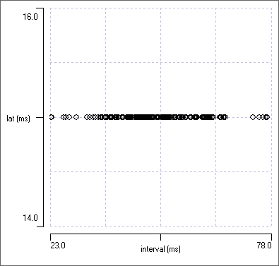
The graph is completely flat with a Y-axis value of 15 ms (remember that this is constructed data), which is pretty convincing evidence that features (events) in channel b follow events in channel a (the reference features) with fixed latency. However, at the moment the X axis is the time of occurrence of the events whose latency we are measuring, which is not quite what we want for our analysis.
- Select Interval 2 pair 1 as the parameter to display on the X axis.
This makes the X axis display the interval between those events in channel 2 which bracket the events in channel 1 whose latency we are measuring. The events in channel 2 define the cycle period, so we are now plotting latency against cycle period, which is what we want. If we just selected the normal Interval parameter for the X axis, we would plot latecy against the interval between the events whose latency we are measuring, which is not what we want (although in fact the graphs would be identical with these artificial data).
- On the scatter graph, click just to the right of the rightmost point on the graph (i.e. where the interval is longest).
This should centre channel b event 77 in the main display, and you can see that the interval between events 77 and 78 in channel a is indeed quite long - in fact, the longest cycle period in the data.
- Now click just to the left of the leftmost point in the graph.
Channel b event 198 is now centred in the main display, and the interval between events 198 and 199 in channel a is quite short - in fact, the shortest cycle period in the data.
The overall conclusion backs up the original claim - the latency with which channel b follows channel a is constant, irrespective of cycle period.
- Switch around the event channels, so that Chan 1 is a, and Chan 2 is b.
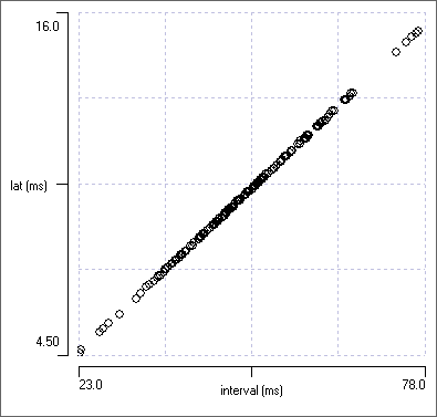
The graph now shows a very strong diagonal trend. This is because the data were constructed such that an event in channel b is "tied" to the immediately preceding event in channel a at fixed latency, but the reverse is not true - an event in channel a is not in any way tied to the preceding event in channel b. In fact, quite the opposite - there will be a long time delay between them if the cycle period is long, and a short time delay if the cycle period is short. This emphasises the crucial importance of selecting the correct event channels for the desired analysis - getting them the wrong way round can lead to a completely erroneous conclusions.
- Switch back the event channels, so that Chan 1 is again b, and Chan 2 is a.
You should again see the flat line indicating latency constancy. - Select Phase 1 in 2 from the parameter drop-down list for the Y axis.
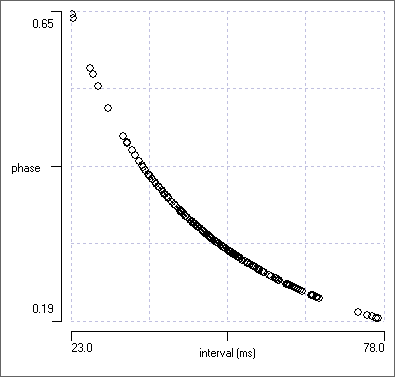
The plot now shows a curving drop in phase as cycle period increases. This is exactly what we would expect for latency constancy. At short cycle periods (on the left) the fixed latency of the channel b event from that in channel a causes the b event to occur late within the cycle defined by events in a and hence with a long phase, but at longer cycle periods (on the right) the same latency causes channel b events to occur early within the cycle and hence with a short phase.

Phase
- Change Chan 1 from b to c.
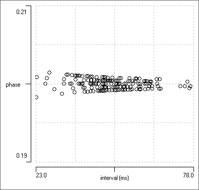
We now again have a more or less flat line, centred on a phase value of 0.2, which confirms that events in channel c are occurring one-fifth of the way through each cycle as defined by events in channel a, irrespective of the cycle period. This is as it should be, since the data were constructed that way.
Why is the line not completely flat, as it was for the latency constant data? The data were indeed constructed to have a phase of exactly 0.2, but, due to digitization, events cannot occur at any arbitrary time on a continuous scale, but only at the nearest time values that are multiples of the sample bin duration. This leads to greater variability at short cycle periods (on the left of the graph), where the number of available time bins is lower. However, note that the variability has exaggerated visual emphasis in this display due to autoscaling the Y axis - the data are actually all very close to 0.2. (There was no variability in the latency plot because the latency was an exact multiple of the sample interval.)
- On the scatter graph, again click just beyond the leftmost and rightmost points to observe the shortest and longest cycle periods.
Note that the events in channel c do not have a fixed latency relative to channel a. Instead the latency is shorter at short cycle periods and longer at long cycle periods. - Switch around the event channels, so that Chan 1 is a, and Chan 2 is c.
The phase of channel a relative to channel c is completely different from that of c to a, again emphasising the importance of getting the feature choice the correct way round for the analysis being performed. - Switch back the event channels, so that Chan 1 is again c, and Chan 2 is a.
- Select Lat 1 from prev 2 from the parameter drop-down list for the Y axis.
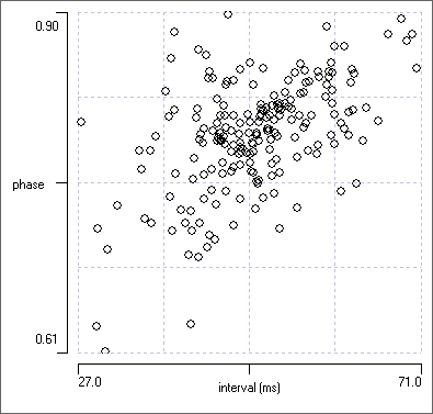
This display emphasises that with phase constant data, the latency scales with the cycle period.
The three graphs are shown below, for comparison with the constant latency data.
Close synchrony
Event channel d contains events that occur at the same time as those in channel a, except that their time of occurrence has been offset in either direction by a random Gaussian variable with a standard deviation of 3 ms. Events in the two channels (a and d) are thus nearly, but not absolutely, synchronous . What do the plots look like now?
- You should have the following options selected from the previous analysis:
- X-axis parameter: Interval 2 pair 1.
- Y-Axis: Lat 1 from prev 2.
- Chan 2: a.
- Now set Chan 1 to d to examine its distribution with these parameters.
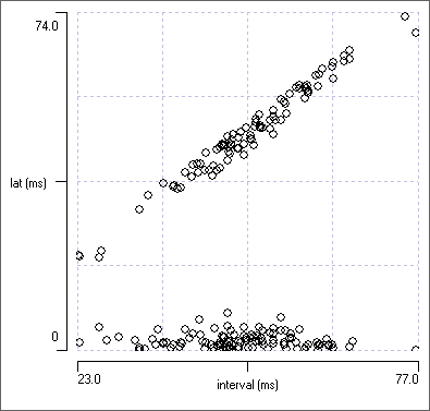
It would appear from the plot (a below) that the latency falls into clear two groups, but this is entirely an artefact caused by the parameter choice of latency from the previous event. For those channel d events that come after their channel a partner, the plot shows a short positive latency (the lower group in the plot). However, for those channel d events that come before their channel a partner, the plot measures the latency from the previous channel a event, and that latency depends on the cycle period, leading to the diagonal group in the plot. The analysis is technically correct, but it is misleading.
- Change the Y axis parameter from Lat 1 from prev 2 to Lat 1 from near 2.
The plot now shows the latency of channel d events from the nearest channel a event, whether it comes before or after it. This is the partner event to which it is almost synchronized, and so the latencies vary within a fairly narrow range of about +/- 8 ms, and have no particular relationship to cycle period. This is more informative.
How do we decide which analysis to choose? Sometimes we suspect (or actually know) that there is a causal relationship between the two channels (e.g. if one marks a stimulus and the other the response). In this case the latency from the previous partner event is obviously the correct choice. In other cases close inspection of the data and comparison of the results is the only way to decide.
What happens to near synchrous data in a phase plot?
- Change the Y axis parameter to Phase 1 in 2.
Again we have two clear groups in the plot, but this results from the linear definition of phase. Those events which just precede their partner will be occurring late in the preceding cycle of the rhythm, and hence have a phase close to 1. Those events which just follow their partner will occur early in the following cycle of the rhythm, and thus have a phase close to 0. It is like a 24-hour clock: 23:00 and 01:00 are actually only two hours apart, but their numerical values superficially suggest a separation of 22 hours.
- Change the Y axis parameter to Phase 1 near 2.
This simply subtracts 1 from all phase values greater than 0.5, so that phase now varies in the range -0.5 to +0.5 (e.g. phase 0.9 becomes phase -0.1). This resolves the visual ambiguity of near synchrony being either close to 0 or close to 1 - it is now always close to 0, but it can have a positive or negative value.
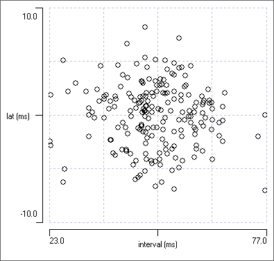
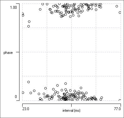
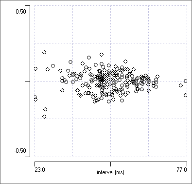
The adjusted phase plot is fine if near synchrony is the only phase relationship that occurs. However, what happens if there are two phase relationships in a data set, one near synchronous (in-phase) the other near the mid cycle (anti-phase)? With the adjusted phase plot the anti-phasic group would again be split, this time between +0.5 and -0.5 phase.
Circular phase plots
- Set Chan 1 to e.
Half of this record contains data identical to channel d (i.e. with a phase of 0/1, but some variability), the other half contains data with a phase of 0.45, but again with some variability. There are 3 apparent phase groups in the Phase 1 near 2 plot - the central group is produced by events in channel e which are nearly synchronous to those in channel a, while the upper and lower groups are the events in channel e with a phase of 0.45 relative to those in channel a.
- Change the Y-axis parameter Phase 1 in 2.
There are still 3 groups, so this does not help.
There is nothing that can be done about this in the scatter graph display. However, if we look at a histogram, there is an alternative solution.
- Select Histogram / statistics from the Event analyse menu to display the Event parameter histogram dialog.
- Select Phase 1 in 2 from the drop-down parameter list.
- Set the Target channel to e and the Reference channel to a.
You should now see a tri-modal display, for the same reason that we saw 3 groups in the scatter plot.
- Check the Show circular plot box (on the left of the dialog just below the middle).
A new dialog opens showing a circular phase plot rather like a clock. There are two clear groups in this display, not the three seen in the standard histogram. The group pointing vertically (towards the 1 / 0 label are the near synchronous events, the group pointing down and slightly to the right are the phase 0.45 events.


Now close the histogram dialog.
Duty Cycle
Return to viewing the scatter graph.
- Set Chan 1 to f.
- Select Interval from the analysis parameter drop-down list for the X axis.
- Select Duty cycle from the analysis parameter drop-down list for the Y axis.
The events in channel f have a duration that varies in direct proportion to the cycle period in which they occur. In other words, their duty cycle is constant, which is why the graph plot is flatDigitization has the same effect in broading the plot as it does for the phase plot seen earlier.. (In fact, the data were constructed so that the duration of each event is 0.2 times the interval between the start time of that event and the start time of the following event, which is the cycle period.) Note that since the same event channel defines both the duty cycle and the cycle period, we do not need to specify a second event channel, and we use the standard Interval parameter for the X axis, rather than the Interval 2 pair 1 parameter that we used previously.
- Switch the Y axis parameter to On Duration.
The diagonal line confirms that the duration of each event is proportional to the cycle period.
- Set Chan 1 to g.
The events in this channel have constant duration, so the plot becomes flat.
- Return the Y axis parameter to Duty cycle.
The plot now follows a declining curve. This makes sense because a fixed duration will occupy a larger fraction of a short cycle period than it will of a long cycle period.
The 4 plots are shown below for comparison. There are obvious similarities to the latency and phase plots seen earlier,


