Cluster Traces
If you have a data file with many traces, some of which contain similar waveforms, it could be useful to cluster the traces into groups, where traces within a group have similar waveforms. You could then average the traces within each group to obtain a reduced-noise representation of the waveforms.
There has to be some metric to define the "shape" of the waveform in order to determine similarity. Of course, the raw data of the waveform itself would be one such metric, but this will inevitably contain a certain amount (possibly a large amount) of noise, and this will contaminate any clustering algorithm. Also, there is likely to be strong serial correlation within each trace, resulting in a lot of redundant information being passed to the clustering algorithm.
A standard way to extract an ordered set of "key features" from noisy data is principle component (PC) analysis. The weighting coefficients of the first few basis waveforms are then used as the data for clustering.
- Load the file many traces.
This file has 38 traces of constructed data, and each trace consists of random noise plus a superimposed fragment of a sine wave. The sine wave has constant frequency but 4 differentThe smallest is 0 - i.e., no sine wave at all. amplitudes, randomly distributed between traces. The aim is to cluster the traces into groups such that traces within a group contain sine waves of similar amplitude.
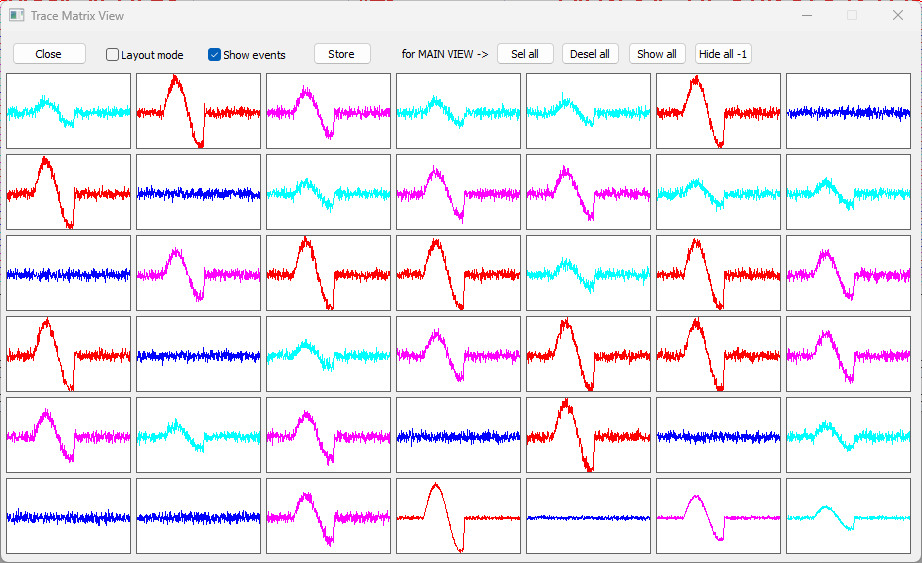
With this number of traces, the data on individual traces are hard to distinguish in the standard Chart view due to vertical compression.
- Select the View: Matrix view: Show menu command to open the Trace Matrix view.
This shows the individual traces in a grid of thumbnails, so the content is more easily visualized.
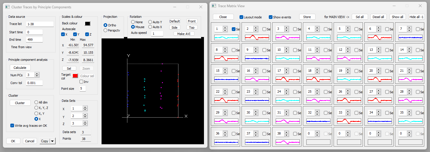
- Select the Analyse: Cluster traces menu command to open the Cluster Traces dialog.
At the top-left of the dialog the Trace list shows the traces that will be clustered. By default this is all traces (1-38), but you could specify just a subset if desired. There is also a Start time and End time, indicating the time window within the traces that will be analysed. By default this window is the entire window visible in the main view. If only a section of the recording shows anything of interest you could zoom in (![]() ) on that section before activatng the dialog. Alternatively, if you place 2 vertical cursors in the main view, the Cluster Traces time window will be set to match the location of those cursors.
) on that section before activatng the dialog. Alternatively, if you place 2 vertical cursors in the main view, the Cluster Traces time window will be set to match the location of those cursors.
The first task is to calculate the principle components of the waveforms and display their weighting coefficients.
- Click Calculate in the Principle component analysis frame.
- You could change the tolerance and number of components if desired, but the defaults are usually satisfactory.
A set of red dots appear in the 3D scattergraph. These are the data (weighting coefficients) we need to cluster. There are 38 dots since there are 38 traces, and since we calculated 3 PCs, each dot is located in 3D space. We can thus display the coefficients on the X, Y and Z axes of the graph. The coefficients are displayed in order, i.e. the X axis shows coefficients for the 1st PC, the Y axis for the 2nd and the Z axis for the 3rd.
The start-up view of the graph is oblique, but it is useful to view it face-on.
- Click the Front button (in the Rotation group, top-right of the dialog).
This presents a 2D view, showing projection on the X and Y axis. It is immediately obvious that there are 4 clusters on the X axis (1st PC), showing as 4 vertical groups of dots. However, the distribution on the Y axis is effectively random, with no obvious clusters.
- Click the Side button.
We now see a Y-Z projection, and there are no obvious clusters. The clusters on the X axis are hidden because they lie in a plane orthogonal to the view.
- Return to the X-Y projection by clicking Front.
- Click the Cluster button in the Cluster group to call up the Cluster dialog.
- The defaults in the Cluster dialog are all OK, so click the Cluster button within the dialog.
- Clustering is based on the algorithmFrom Bouman's web page: "The ... program applies the expectation-maximization (EM) algorithm together with an agglomerative clustering strategy to estimate the number of clusters which best fit the data. The estimation is based on the Rissenen order identification criteria known as minimum discription length (MDL). This is equivalent to maximum-likelihood (ML) estimation when the number of clusters is fixed, but in addition it allows the number of clusters to be accurately estimated." developed by Charles A Bouman (Copyright © 1995 The Board of Trustees of Purdue University"In no event shall Purdue University be liable to any party for direct, indirect, special, incidental, or consequential damages arising out of the use of this software and its documentation, even if Purdue University has been advised of the possibility of such damage. Purdue University specifically disclaims any warranties, including, but not limited to, the implied warranties of merchantability and fitness for a particular purpose. The software provided hereunder is on an "as is" basis, and Purdue Univeristy has no obligation to provide maintenance, support, updates, enhancements, or modifications." And the same goes for DataView! ).
Only 1 cluster is found!
The problem is that we are looking for clusters in 3 dimensions (the coefficients of the 1st 3 PCs), but only 1 of these actually contains clusters, the others are random. These random values swampThe algorithm treats all dimensions as of equal importance. Because these are principle components we know that the 1st dimension is the most important, but the algorithm does not know this. the algorithm, so that it does not detect the clusters in the single dimension.
- Click Cancel in the Cluster dialog to dismiss it and return to the parent Cluster Traces dialog.
Note that by default All dimensions is pre-selected in the dimensions radio-button choices to the right of the Cluster button.
- Select X in the dimension options (the bottom choice).
- This means that the clustering algorithm will only look for clusters in the data on the X axis.
- Click Cluster again in the Cluster Traces dialog, and in the Cluster dialog.
- Note that 4 sub-classes are detected, and that the 4 vertical groups in the 3D graph now have different colours.
- Click OK in the Cluster dialog to return to the Cluster Traces dialog.
- You can drag the 3D graph with the mouse to change the view, but the frontal XY view shows the clusters most clearly.
- Uncheck the Write average traces on OK box in the Cluster Traces dialog.
- If left checked this would automatically launch the Transform: Average traces by colour command. Normally, this would be useful, but for this tutorial we will treat that as a separate process.
- Click OK in the Cluster Traces dialog to close it.
Now, each trace is colouredThe order of colours may vary, because the clustering algorithm involves a randomization element. according to the group that it belongs to, which depends on the amplitude of its sine wave. This is most obvious in the Matrix view that you launched at the beginning of the tutorial. Thus trace 1 contains the smallest sine wave, as do traces 4 and 5, and other traces in the same colour. Trace 2 contains the largest sine wave, while trace 7 is only noise - the sine wave amplitude is 0.
Note: The traces have been coloured according to the group to which they belong, but this information has not yet been written to file. If you want to keep the colours, you must Save this file, or use Save As to write a new file.
Average Traces by Colour
If you are following on from the previous tutorial (Cluster Traces) then you will have a data file ready for use. If not:
- Load the file many traces coloured.
There are 38 traces of constructed data, and each trace consists of random noise plus a superimposed fragment of a sine wave. The sine wave has constant frequency but 4 differentThe smallest is 0 - i.e., no sine wave at all. amplitudes, randomly distributed between traces. The traces have been clustered into 4 groups according to similarity in their waveforms, and the group identity is coded by the colour in which the trace is drawn.
The aim is to average the waveform for each group, and write each average as a new trace.
- If it is not already active, select the View: Matrix view: Show menu command to open the Trace Matrix view.
- Note that there are 4 empty cells at the bottom right of the view, which is a happy coincidence.
- Uncheck the Layout mode box in the Matrix view (if it is checked) to maximize the grid size.
- Select the Transform: Average traces by colour menu command to open the Average Traces by Colour dialog.
- The dialog shows the trace group composition for information, but all the other default options are satisfactory.
- Click OK to proceed, and select a new file name when one is requested.
The new file loads, and there are 4 new traces (39-42). These conveniently fill the empty cells in the Matrix view. (If there had been insufficient empty cells, we would have had to close the view and reconfigure it with more cells to see the new data.)
The new traces are the point-by-point averages of the 4 trace groups. However, the default gain for the new traces is too low for this to be obvious.
- Select the Traces: Same scale menu option.
- This gives all the axes the same scale as the first (or first selected) axis, which in this case is axis 1.
- Uncheck the Layout mode box in the Matrix view to maximize the size of the individual cells.
You can see that the last 4 cells of the Matrix grid are averages of the previous cells of the same colour. There is consequently a reduction in the noise in these traces, making the underlying sine wave clearer (although it was fairly clear even in the raw data).
Standard Deviation
The Average Traces by Colour dialog has a check box labelled Write SD trace. By default this is not checked, but if you check this before clicking OK, then an additional trace is written for each group. Each average trace is followed by a trace showing the point-by-point standard deviation of the traces in the group.